Showing posts with label retouching. Show all posts

8/14/12

Iron Lung 4-Pack - Capsule hotel?

Here's something you don't see every day. No, not four Americans in Japanese capsule hotels. No, not people in iron lungs. Maybe you should just stop guessing and let me tell you, okay? Shut up. It's a completely airbrushed head where there was  no head before!
But first, what's an iron lung? Uuh, let's see. How to summarize. People who couldn't breathe on their own (usually from polio) were put in a machine like this one. An air tight seal is formed around the person's neck, and by using pumps to vary the pressure around the person's body, it effectively reproduced the process of respiration... if you can accept the fact that you're stuck in a giant metal tube. Good times.

Iron lungs were in widest use in the 40s and 50s, due to polio outbreaks. Polio is a viral illness that attacks the nervous system and eventually causes paralysis. Respiratory failure (paralyzed lungs) is one of the first ways polio tries to kill you. Since the mid-century, the polio vaccine has all but eradicated the disease (...but not if Jenny McCarthy has her way. Good job, retard.) People still need mechanical assistance with breathing for various reasons, but much smaller, portable ventilators now exist which allow some mobility and don't make you look like you live in The Matrix.

So what's this about a fake head? Check out the lady in the picture in the top at the back. It looks like they only had three models and had to paint in a fourth head. Either that, or for some reason or other, this model's face had to be completely replaced by an artist. Orrrr, she died shortly before the photo was taken and nobody noticed until after the shoot. Orrrrrr, the unfortunate woman not only suffered from polio, but had to be fitted with a prosthetic head, possibly due to a mishap in a magic show. Orrrrrrrrrrr, she's a mannequin who has trouble breathing, poor thing. Let's assume the head was just painted.


10/5/10

Mars Bar - Made with rich creamery brains.

Back in Yore (1950), there was no Photoshop. This places 1950 at a disadvantage. They didn't have wonderful things like Photoshop Disasters to laugh at. Yes, the proliferation of illegal copies of Adobe's image-mangling software has placed the tools of personal humiliation in the hands of every multicellular life form in the first and second worlds, but it still takes skill and a good eye to judge what to do, how to do it, how much to do, and when to frikkin stop trying, for chrissakes. Don't get me started.

It was still the case even before the dawn of digital fakery. All they had was the airbrush. This ad for Mars bars has some nice retouching. The candy bar has been "plussed up" as they say. The spoons of various sugary goops look tempting and savory. Good job faking in the giant candy bar in the woman's arms. She was shot holding nothing, and the product picture was spliced in with an X-Acto and rubber cement.  Know what, though? The lady holding the candy bar looks like a Stepford wife.

The art director probably asked the artist to touch up her face. That's some pretty fine work for the time. I don't know how large a print they had to work on, but they should have stayed away from the eyes. You'd need a print the size of a soccer field to have the control and detail you'd need to do it right. But, clearly all the photo print shops with FIFA-sized development baths were booked that weekend, and the artist was handed a print maybe 18x24 inches. "Do up her eyes." the art director ordered. "Make em blue. Everybody needs blue eyes." Prick. It was the fifties after all. White people didn't want to be reminded that there were non-honkies in their country unless they were mowing their lawn.

So, what you're left with is this dead-eyed zombie woman staring at nothing. Or actually, she's staring at TWO nothings, since she's slightly walleyed. What may have helped her is a little mascara. They dropped in two blue dots and her eyes became flat and dead, like a doll's eyes. Here's my five-minute attempt to fix it a little. I just put her eyelashes back in and added some depth to the blue dots. Now she's less scary. Now I can sleep tonight. I didn't like the idea that a zombie woman was selling me candy made from sweet, delicious brains.

8/10/10

Plywood Dinette Ensemble - Welcome to the dollhouse.


A magazine like Popular Mechanics is likely to draw a reader base of men who are of the "Why buy one when you can build one?" philosophy. Good for them! Every woman is basically a little girl on stilts with all the same dreams and desires as her former five-year-old self. Right? Of course I'm right! That's why every man returning from dubya-dubya-eye-eye with a can-do attitude needed to build his wife a plywood dinette set to get that "We live in a giant dollhouse" look.

See how fun? Sure, there were other, more elegant and sleek plywood furniture designs out there, but all those were way harder to build, and all required the especially tricky technique of bending plywood with steam. These things were best left to a factory, what with the pressure and the heat and the clamping and the giant tanks of water. (Although, truth be told, I aim to have a go at some plywood bending myself some day. The results can be beautiful.)

Nope, this enchanting plywood dinette ensemble is much simpler. It could be whacked together by the scruffiest knuckle-walking oaf whose toolbox contains a wide array of carefully selected hammers. There'd be a special hammer for driving screws, and a special painting hammer, and a really nice one for fixing windows. All the parts for this dinette set are completely flat, and can be cut out of a few sheets of plywood. You'd never guess, huh? If anything, it looks like it was made out of cardboard by a giant child. But plywood? Hard to believe.

For the finishing touch, the fellows at "Pop Mech" painted the furniture a nice yellow, do go with the pink walls, gray carpet and "everything" curtains. Even the table cloth looks like a huge hankey. I can almost imagine the happy husband and wife sitting down to dinner in their three-walled dining room, ready to enjoy their slightly out-of-scale turkey leg and banana. And look at the size of those buttons! The illusion of miniature-ness is very thorough.

This article was very thorough, with diagrams and cutting patterns and everything. Let's just turn the page and see what ... AAAAH! Jesus Christ!
She IS a doll! Or maybe some kind of domestic  homunculus? Those creepy, staring, painted-on eyes! The wicked smile! I'm going to have nightmares about this.

 By what witchcraft has this unholy abomination been allowed to walk the Earth? Forget building her some furniture. Any carpenter with a shred of decency would just drive a stake through her heart and end her tortured existence. Hopefully our guy has a special hammer for putting down animated golem ladies. He'll need to make a stake though... probably out of plywood.


*Editor's note: The reader is asked to forgive the mixed mythological references to zombies, Hebrew legend, homunculi, and vampires. The exact nature of the horror in question at the time of writing was very much... uuh...in question.

3/10/10

Chox Hot Chocolate - Watch the tongue, kid.

Location: Beatrice food, 1948, October was just around the corner, and the weather in much of the country would be turning cooler. It was almost the high water mark for anyone in the heated-sugary-milk industry, and the Chox brand was ready to seize the lion's share of the market.

The executives had entertained proposals from the marketing department. The meeting and deliberation had taken a long time. The board room was filled with cigarette smoke, and the butts were an inch deep on the floor. It was 1948 after all. It was all worth it, because they had the perfect campaign lined up. It wasn't very innovative or clever, but these were not the things that drove the sweetened dehydrated lactic goop market. Tradition. Comfort. Familiarity.Warmth. This is how you got the mother's dollar in the fall.

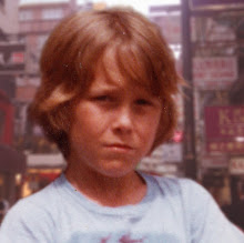
The director tapped his pen on the desk, deep in thought. They'd need an adult female hand model, aged 30-35 and one boy. This boy had to have that Tom Sawyer "aw shucks" all American look. Definitely a plaid shirt. He'd have to look reeeeally happy about hot chocolate. Hmm. Flipping through headshots. He would be ordering lunch. This could take a while.

Wait. Who was that kid they used for the erector set ad in Boy's Life? The kid with so much energy they had to use high speed film just to keep him in focus? Kevin something. The director's finger stabbed the intercom. "Get me the talent agency. I got our boy!"

Zip pan to photo studio interior. Light is dim, apart from the set, consisting of a kitchen table and one chair. The perspective between the cup of chocolate and the kid meant that the shot would have to be comped later. The foreground elements would be shot separately from the boy so that they both could be in focus. The two shots needed different lenses. That was extra time of course, but the art department had a guy who was a wizard with the x-acto. They'd airbrush the steam in later, as usual.

They were getting the right energy from Kevin, but something was still not there. The kid's hair was a little messy, as if he had just climbed down from his tree house. They tested different angles for the kid's head and messed with the lighting. Eventually they  realized they needed a little backlighting so you could see the chair the boy was sitting in, until then, he looked like he was belly up to a bar or something. Closer, but still not right.

Then the photographer had it. "Yoo-hoo, Timmy or whatever, stick out your tongue, honey, like Wiley Coyote. Farther... more.... yes! Now move it to one side. No. Other side. Bingo! It was horrible, but the director knew it would sell. It was an utterly unntural gesture that no human had ever performed willingly. Mouth wide open in a huge grin. Tongue poked out of the corner of his mouth like he's, what? Licking his lips? Only cartoon characters did that. No boy had ever made that face, and he looked borderline insane. Insane for Chox hot chocolate. "That's lunch, everybody!"


2/26/10

Kelvinator - Hybrid Species

For a long time (I'm going to say 1950's -1960's), it was pretty fashionable to use photographs in print ads, but to "plus them up" with some airbrushing - either lightly or rather heavily. In this ad from Kelvinator we see a strange array of airbrushing, from mostly-photo-with-light-airbrushing, to completely cartoony.

The topmost picture is only lightly retouched, but if you look really closely at her face, her eyebrows are pretty seriously drawn in... like with a sharpie. The woman in the middle picture is a kind of middle ground, as if they started with a photo and then had the artist paint over her completely. Cute eyes though. At the bottom we see Wilma Flintstone a cartoon of a woman completely made up. She could have been drawn by Hanna-Barbera. When I look at her, I imagine her being voiced by June Foray.

Here's a perspective goof they missed. Look at the floor area of the bottom picture (even though there is no floor in it). The fridge's front and back feet are even with each other, as if the camera is lying on the floor. Now look at the woman's feet. The front foot is lower than the back foot, as if the camera is at waist height. The perspectives don't match. Maybe she's stepping down off a little footstool that wasn't painted in, along with the unpainted floor? This is a pretty minor fumble, but it makes me feel like a big man to point it out. There. Now I am a big man. That would explain the difference in floor height.

The tile in the top picture is very anachronistic. That tile may have been in fashion in 1961, the year this ad was published, but I associate that green-with-white-smears tile with basements and gas station bathrooms. Now that I picture this tile in my head, I also see it chipping away in spots, revealing salmon-colored tile underneath, with the chippy green crumbly bits sliding around under my feet as I wonder if I've just contracted dysintery from the sink.

Wait a second. Those aren't coffee pots in these pictures. They're hukka pipes! What goes on? Now I know the truth behind her smile. Look at her. That's a "please don't tell on me" smile. It looks like people really knew how to start the day right, back  in '61!


12/24/09

Westerm Auto Refrigerator - Primordial Photoshop

In 1957, if you wanted to "plus up" a product shot, you reached for your airbrush.... or you reached for your staff artist, who, in turn, reached for his (most likely "his") airbrush. This was back when "photo shop" meant "a shop where photographs are worked on".


First, you'd start by taking a picture of your product, and then having a print made in large format. You know... about the size of a canvas? The photo retoucher then went to work clarifying shadowy areas, adding contrast,  and generally highlighting the hell out of the product. Surfaces were made shinier. Areas of low contrast got dark outlines around objects.

Above, we see a refrigerator ad for Western Auto. I guess I'm not old enough to be familiar with the brand. But look at that fridge! Ignore the fact that the interior is molded in "intestinal pink", presumably to help you imagine how the food will look in your belly. It's been heavily airbrushed. So much so, that there is not discernible light source other than "sort of everywhere". The food products in the fridge look positively cartoony. The metal trim at the bottom has recieved the old "metal sheen" treatment.

The point was not to make it look more real. The point was to make it "ideal", which, depending on the disposition of your art director, may be "Disney style". My favorite part of this picture? The landscape outside the window. Rectangular marshmallow trees! Hooray! I want to go play outside in Picasso Grove after the photo shoot.

In case you don't like the pink interior, I'm sure the fridge was available in "avocado splatter" and "golden shower" to help you imagine your food exiting your body in various ways, if you're into that.


10/5/09

Analog Retouching - The toolbar of 1966

Here's what they had to work with in 1966: an airbrush. A real airbrush made out of machined brass and plated with chrome. Just like Photoshop, it was a beautiful tool that, in the hands of a dedicated idiot, could do some real damage.
This was an article in Life magazine about some new Truman Capote novel about a murdered farmer in Kansas. The murder actually happened, and here's the mangled newspaper photo to prove it. The picture was reprinted in the Life article about the novel. I can't tell if the photographic pummeling was done by a Life staffer (unlikely, as Life was a national publication that probably had decent artists in-house) or an artists working at the local Kansas paper that ran the original story. I'm guessing it was the latter.

There's a site I visit daily called Photoshop Disasters. They post unbelievable photo molestations found on the web and in print, out in the real world. PSD pretty much has  made it their mission to call out terrible artists who have no business doing art. Some may call it mean, but I think that people who have no business sticking their nose into Photoshop shouldn't stick their nose into Photoshop.

The digital revolution, like so very many technologies, has brought the tools of production within easy reach of nearly everybody. Who should have the tools of production within easy reach? Something less than almost everybody, if results count for anything. Back in '66, there were more excuses for bad retouching. The local Kansas paper had a small talent pool to draw from. The picture may have needed to go to press really quickly, allowing very little time to do the retouch. Mostly, though, I think skill with the tool can be blamed. I have an airbrush, and they  are hard to control. Granted, I didn't concentrate daily on improving my skill like a career airbrush guy would. Still, getting the feel of a tool like a dual-action airbrush is something that takes years to get decent at, to say nothing of mastery. At least in the digital realm, there's CTRL+Z to help you get the hang of it.

The moral of the story is, the digital revolution has brought the tools of shitty art within easy reach of nearly everybody.