Wifi dispenser. Are YOUR hands 5 GHz compatible, or just 2.4?
Showing posts with label technical. Show all posts
1/18/24
12/13/19
6/20/17
Photo-Shoppe! Photo-editing for 1934.
If you have a passing familiarity with Adobe Photoshop, you've probably noticed that some of the tools have icons and names that are not descriptive or otherwise indicative of the tool's function. You may be given to wonder "Why the fuck, in this time of Great Understanding and Intuitive User Experience, are some of Photoshop's tools so abstruse? What the precise fuck?"
Well, there is a reason. It's because some of the more basic tools in Photoshop are derived from darkroom techniques that date back to.... well, from a really long time ago, is all. When Adobe first created Photoshop (in like 1987, sheesh!), it was designed pretty much for scanning editing photographs. And so, its tools were named for the traditional darkroom techniques they emulated. As Photoshop evolved, the names were left a sthey were to keep from confusing long-time users, while completely baffling newbies.
This article (scroll down) from a 1934 copy of Popular Science gives us a clue as to the origins of the DODGE tool, which is used to lighten areas of an image.
But first, let's see where we are, so we can understand where we came from.
In the tool bar, the dodge tool looks like this. You may have mistaken it for a magnifying glass, but nope, it's just supposed to look like a "shielding card" on a stick. In the article, you'll see that, back in dinosaur times, you'd use pretty much whatever you could find to allow more or less light to fall on an area of the negative during the process of making a copy. This allowed the photographer to selectively brighten or darken areas of a photo during exposure of a print during duplication. See?
Anyway, the dodge tool is used to brighten pixels. It has an opposite partner, called the BURN tool, which will darken image pixels, and it looks like this (see left).
If you're using the most recent version of Photoshop - Photoshop CC, or "creative cloud" (ugh) - both of these tools have been tossed into a single catch-all icon in the tool bar that looks like a set of ellipses, as in "here's the rest of them". You'll have to click and hold on those dots to make Photoshop show you all the useful stuff they threw in there, as if they were ashamed of them.
If you have an older version of Photoshop, the dodge and burn tools probably have their own spaces on the tool bar and are visible all the time.
So, if you're a dinosaur, here's how you edited your photos back in 1934. Complete article follows. But first, the cover of the magazine.
Well, there is a reason. It's because some of the more basic tools in Photoshop are derived from darkroom techniques that date back to.... well, from a really long time ago, is all. When Adobe first created Photoshop (in like 1987, sheesh!), it was designed pretty much for scanning editing photographs. And so, its tools were named for the traditional darkroom techniques they emulated. As Photoshop evolved, the names were left a sthey were to keep from confusing long-time users, while completely baffling newbies.
This article (scroll down) from a 1934 copy of Popular Science gives us a clue as to the origins of the DODGE tool, which is used to lighten areas of an image.
But first, let's see where we are, so we can understand where we came from.
In the tool bar, the dodge tool looks like this. You may have mistaken it for a magnifying glass, but nope, it's just supposed to look like a "shielding card" on a stick. In the article, you'll see that, back in dinosaur times, you'd use pretty much whatever you could find to allow more or less light to fall on an area of the negative during the process of making a copy. This allowed the photographer to selectively brighten or darken areas of a photo during exposure of a print during duplication. See?
Anyway, the dodge tool is used to brighten pixels. It has an opposite partner, called the BURN tool, which will darken image pixels, and it looks like this (see left).
If you're using the most recent version of Photoshop - Photoshop CC, or "creative cloud" (ugh) - both of these tools have been tossed into a single catch-all icon in the tool bar that looks like a set of ellipses, as in "here's the rest of them". You'll have to click and hold on those dots to make Photoshop show you all the useful stuff they threw in there, as if they were ashamed of them.
If you have an older version of Photoshop, the dodge and burn tools probably have their own spaces on the tool bar and are visible all the time.
So, if you're a dinosaur, here's how you edited your photos back in 1934. Complete article follows. But first, the cover of the magazine.
Cool worn paper, huh? This magazine looks like it spent all eighty-three years at the bottom of an ocean in that weird tractor thing. You could probably use a transparent image of all that scrubbed paper and worn edges for all your future image-ruining adventures, couldn't you? Coming right up.
Here's the article. You know the drill: Click it to big it, baby. Hey, at the end of the article, be sure not to miss the stunning science news about suction cups. Hoo boy.
Labels:
1934,
photography,
photoshop,
popular science,
technical
1/8/16
Mercury Colony Park - You got to let thirds rule.
A bright-eyed intern from the Magazine Search Pool dropped this 1964 ad on my desk this morning. That kid's going to go places. Why? Because she immediately spotted the near-perfect layout of this ad. Check it out.
Man, look at that. A nice composition is like classical music for your eyes. You can feel it making you smarter. But maybe you're not seeing the magic? Let's help you out a bit.
Faced with yet another product shot of their car, the art director could have phoned it in. They could have gone with some kind of perspective thing, where they drop the car in a field or something and shoot it from the corner, to show you how big the car is. But when you read the copy, you can tell that Mercury was kind of proud of the design of the car.
The beauty of a fake wood paneled station wagon is debatable, but in any case, they looked at the rectangular, slab-sided profile of their car and lined up the camera directly at the profile. Then, they put the car in front of a building that echoes the wooden linearity. The net effect of this decision flattens the car and the building into simple graphic shapes that - if handled well - can form a bold and clear composition that catches the eye.
If you look at the roof of the car in relation to the overall length, you can see the roof line is about two thirds of the car's length. You can divide the car's length into threes, and the roof takes up two of them. Then, notice that the belt line of the car falls about two thirds of the way from the ground to the roof. This all recalls the "rule of thirds": an old and ubiquitous tool that artists and photographers use to arrange pleasing compositions. Your camera probably has a rule of thirds overlay in the LCD screen. Your phone's camera app probably has one too, if you find it and enable the option.
Essentially, the rule of thirds is this: if you drop a three by three grid over your image and try to place points of interest along the lines, or the intersections of those lines, you're most of the way to having a really nice composition. The easiest way to make the leap from just taking pictures to creating a little piece of art is to start paying attention to the rule of thirds. Same for traditional art, too. In a nutshell, putting the focal point right in the center of the frame is really boring. It's what a six year old would do. Asymmetry is more interesting to your eye. Don't believe me? Go look at some stuff and come back in an hour.
So, the form of the car itself adhere to the rule of thirds. That's a nice start. Now, back to the whole photo. Let's put a three by three grid over the ad.
Well, look at that. The Colony Park is centered on a line one third of the height of the frame. This is not an accident.
The other details of the photo add interest too, like the lady and the stuff in the window.No, the window is not one third the width of the photo, but that's okay. The other elements in the image don't all need to slavishly adhere to the rule of thirds in their arrangement. To do that would be a little obsessive, and missing the point a bit. The ROT is just a near-perfect tool to place the major focal points of your image in a position that's far more interesting than just dead center.
The rest of the ad is similarly simple and beautiful. The pavement is just a big black rectangle, with the pavement's texture nearly eliminated. That way, the visual relationship between the wood in the building and the car is clearer. Here's another handy rule for pretty much art of any kind. "If it's not needed, remove it." The pavement texture wouldn't be helping, so out it can go.
With regard to color, the photo basically consists of four colors: red, brown, white, and black. Again, simple and controlled.
I like the two-box shape of wagons and hatchbacks, but lots of people don't. Overall, the deft application of artsy-fartsy skill on display in this ad does a pretty amazing job of making the much-maligned station wagon seem sophisticated and elegant, which can't be that easy. Very impressive, Art Director.
That's a pretty cool looking building. I wonder where it is. The ad is considerate enough to use the address as a design element, and it's easy to read. 17600 Northland Park Court. That's a pretty uncommon name for a street. How many of those can there be?
Okay, it looks like there's a 17600 Northland Park Court in Southfield, Michigan. Could this be the place? Michigan makes sense, as it was still the center of American car production back in '64, and the art director may want to stay close to the office for the shoot. Let's assemble a Street View away team and beam down to have a look around.
Well I'll be darned. There it is, wood and all. The parking lot has been grassed over, but there's the shot right there, untouched... at least, as recently as 2012. Holy crap.
This whole area looks pretty much un-demolished since it was built in The Sixties. Across the street and one or two doors down, there's another cool building with a crazy uppey-downey roof that no one would build today. See?
Looks like there's lots of cool stuff to see in Southfield. Who's up for a road trip? We'll need to load up the station wagon...
Man, look at that. A nice composition is like classical music for your eyes. You can feel it making you smarter. But maybe you're not seeing the magic? Let's help you out a bit.
Faced with yet another product shot of their car, the art director could have phoned it in. They could have gone with some kind of perspective thing, where they drop the car in a field or something and shoot it from the corner, to show you how big the car is. But when you read the copy, you can tell that Mercury was kind of proud of the design of the car.
The beauty of a fake wood paneled station wagon is debatable, but in any case, they looked at the rectangular, slab-sided profile of their car and lined up the camera directly at the profile. Then, they put the car in front of a building that echoes the wooden linearity. The net effect of this decision flattens the car and the building into simple graphic shapes that - if handled well - can form a bold and clear composition that catches the eye.
If you look at the roof of the car in relation to the overall length, you can see the roof line is about two thirds of the car's length. You can divide the car's length into threes, and the roof takes up two of them. Then, notice that the belt line of the car falls about two thirds of the way from the ground to the roof. This all recalls the "rule of thirds": an old and ubiquitous tool that artists and photographers use to arrange pleasing compositions. Your camera probably has a rule of thirds overlay in the LCD screen. Your phone's camera app probably has one too, if you find it and enable the option.
Essentially, the rule of thirds is this: if you drop a three by three grid over your image and try to place points of interest along the lines, or the intersections of those lines, you're most of the way to having a really nice composition. The easiest way to make the leap from just taking pictures to creating a little piece of art is to start paying attention to the rule of thirds. Same for traditional art, too. In a nutshell, putting the focal point right in the center of the frame is really boring. It's what a six year old would do. Asymmetry is more interesting to your eye. Don't believe me? Go look at some stuff and come back in an hour.
So, the form of the car itself adhere to the rule of thirds. That's a nice start. Now, back to the whole photo. Let's put a three by three grid over the ad.
Well, look at that. The Colony Park is centered on a line one third of the height of the frame. This is not an accident.
The other details of the photo add interest too, like the lady and the stuff in the window.No, the window is not one third the width of the photo, but that's okay. The other elements in the image don't all need to slavishly adhere to the rule of thirds in their arrangement. To do that would be a little obsessive, and missing the point a bit. The ROT is just a near-perfect tool to place the major focal points of your image in a position that's far more interesting than just dead center.
The rest of the ad is similarly simple and beautiful. The pavement is just a big black rectangle, with the pavement's texture nearly eliminated. That way, the visual relationship between the wood in the building and the car is clearer. Here's another handy rule for pretty much art of any kind. "If it's not needed, remove it." The pavement texture wouldn't be helping, so out it can go.
With regard to color, the photo basically consists of four colors: red, brown, white, and black. Again, simple and controlled.
I like the two-box shape of wagons and hatchbacks, but lots of people don't. Overall, the deft application of artsy-fartsy skill on display in this ad does a pretty amazing job of making the much-maligned station wagon seem sophisticated and elegant, which can't be that easy. Very impressive, Art Director.
That's a pretty cool looking building. I wonder where it is. The ad is considerate enough to use the address as a design element, and it's easy to read. 17600 Northland Park Court. That's a pretty uncommon name for a street. How many of those can there be?
Okay, it looks like there's a 17600 Northland Park Court in Southfield, Michigan. Could this be the place? Michigan makes sense, as it was still the center of American car production back in '64, and the art director may want to stay close to the office for the shoot. Let's assemble a Street View away team and beam down to have a look around.
Well I'll be darned. There it is, wood and all. The parking lot has been grassed over, but there's the shot right there, untouched... at least, as recently as 2012. Holy crap.
This whole area looks pretty much un-demolished since it was built in The Sixties. Across the street and one or two doors down, there's another cool building with a crazy uppey-downey roof that no one would build today. See?
Looks like there's lots of cool stuff to see in Southfield. Who's up for a road trip? We'll need to load up the station wagon...
![]() |
| Click for big. |
11/4/15
Trade School Sonnets - Lapped Spool and Floating Sleeve Assembly
O! Lapped Spool and Floating Sleeve Assembly
Do you know no rub?
Does your spool suffer no chafe at the walls of your sleeve?
O! Would that I were as smooth. As unsmirched.
By the privations and hurts bestowed by love.
I have no air bearing. I have no dynamic o-ring seals.
My heart is worn by pipe scale and other air line contaminants.
It does not float on a cushion of pressurized oil-misted air.
But you, O Lapped Spool and Floating Sleeve Assembly,
You will never know these hurts, this love.
And so, Lapped Spool and Floating Sleeve Assembly,
I pity you and your two micron surface finish on outside diameter of spool,
And inside diameter...
of sleeve,
Which make it difficult for air line contaminants
to adhere.
Thus do I shed a tear for you,
Lapped Spool and Floating Sleeve Assembly.
Woe is Lapped Spool and Floating Sleeve Assembly.
4/29/15
Crisis! How can we store human knowledge?
Crisis! AAAAAaaaaaaa!!!! Fellow humans, we have a problem of pants-moistening urgency! WTF are we supposed to do with all our knowledge, huh??? Where the hell do we put it all? It's almost easier to do everything from scratch every time you need something than to find out how somebody's done it before. How will we remember everything? How will we organize what we remember? Time to lose your shit, everybody! Commence the shit-losing! All shit must be lost by everyone immediately! DOOOOOOMED!
DOOOOOOOOOMMMED!!!!!!!!!
(Full article from November 1962 issue of Popular Mechanics follows.)
DOOOOOOOOOMMMED!!!!!!!!!
![]() |
| A young John Favreau poses with a reel of 35mm data film, four years before he is born. |
10/24/14
Trade School Sonnets - I Dream of an RD4152G Pressure Regulator
I Dream of an RD4152G Pressure Regulator
by Jane Austen
How dare I rise to meet another daywithout him?
How can I bear to bore and tap a 1/4 20 hole
knowing he does not know?
Can I chamfer an edge to 1/32 radius
before I know if I am dear to him?
O! The cutting oil flows milky white
and gathers in the ewer.
Like milk of kindness
laced with jagged shavings.
Do not drink the kindness in the ewer!
How dare I bear the pressure in my chest?
The pressure of longing
for his longing.
How can I relieve the underside of the mounting plate
to save weight?
I cannot relieve my waiting.
O! The pressure!
O! My love.
Save me, RD4152G Pressure Regulator.
You are rated at a primary pressure of 20.7 bar.
Your price includes gage, fittings, mounting studs and gasket.
8/5/14
Trade School Sonnets - My Love is like a Multi-Bushing Roller Chain Sprocket
My Love is like a Roller Chain Sprocket
My love asked me "Do you love me, my love?"
I looked through the window at the sunlight
playing upon a Roller Chain Sprocket
on the bench
'neath the spreading boughs of June.
"My love", I said, "is like unto a Roller Chain Sprocket."
"For its teeth are chamfered to prevent wear."
"For it is steadfast, yet freely rotating."
"For it is available with from one to three bushings."
"But," I said, "My heart has but one bushing for you."
"And it is fixed with a pin to the drive axle,"
"which can stick if it hasn't been serviced in a while."
My love sipped his tea with flustered hands.
end
9/13/13
Elkhart Lake Vintage Classic 2013 - Pt. 5. - Other of interest.
Today we're posting the last batch of pictures from the Vintage Festival. Back to the jokes on Monday. We love going to the vintage races, and you can expect to see more reports next season, as I continue to put experience points into my photography skills, in the hope of leveling up every few boss fights.
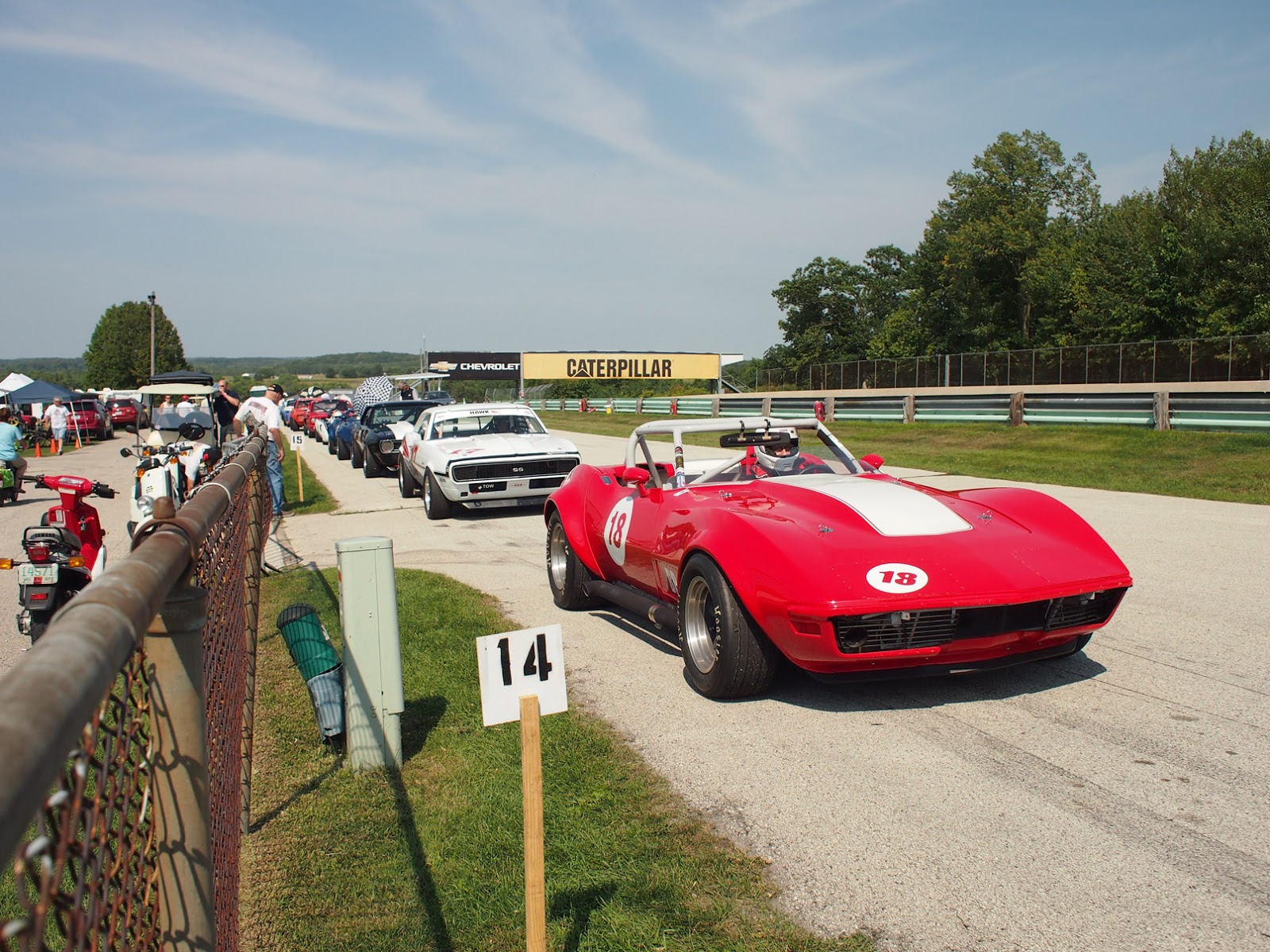
This is one of the Chevy Cheetahs from Monday's post, with it's owner at the wheel. If you appreciate this car enough to own one, could you let someone else have the fun of driving it in anger? |
Here's the Studebaker I hinted at yesterday. It's not my favorite era, but the age of the thing still deserves respect. |
I nearly missed this shot, but the car was so cool looking I had to use it. I don't know where this thing was hiding, but I couldn't find it in the paddock. |
I saw this for the first time at the dinner time car show. It looks like some kind of prototype or test mule. Crazy looking. |
We passed this great sign for a restaurant with a great name on the way home. Midway Eat!The nonexistent grammar makes it almost feel Japanese, doesn't it? |
Labels:
cars,
photography,
technical,
vintage racing
Subscribe to:
Posts (Atom)