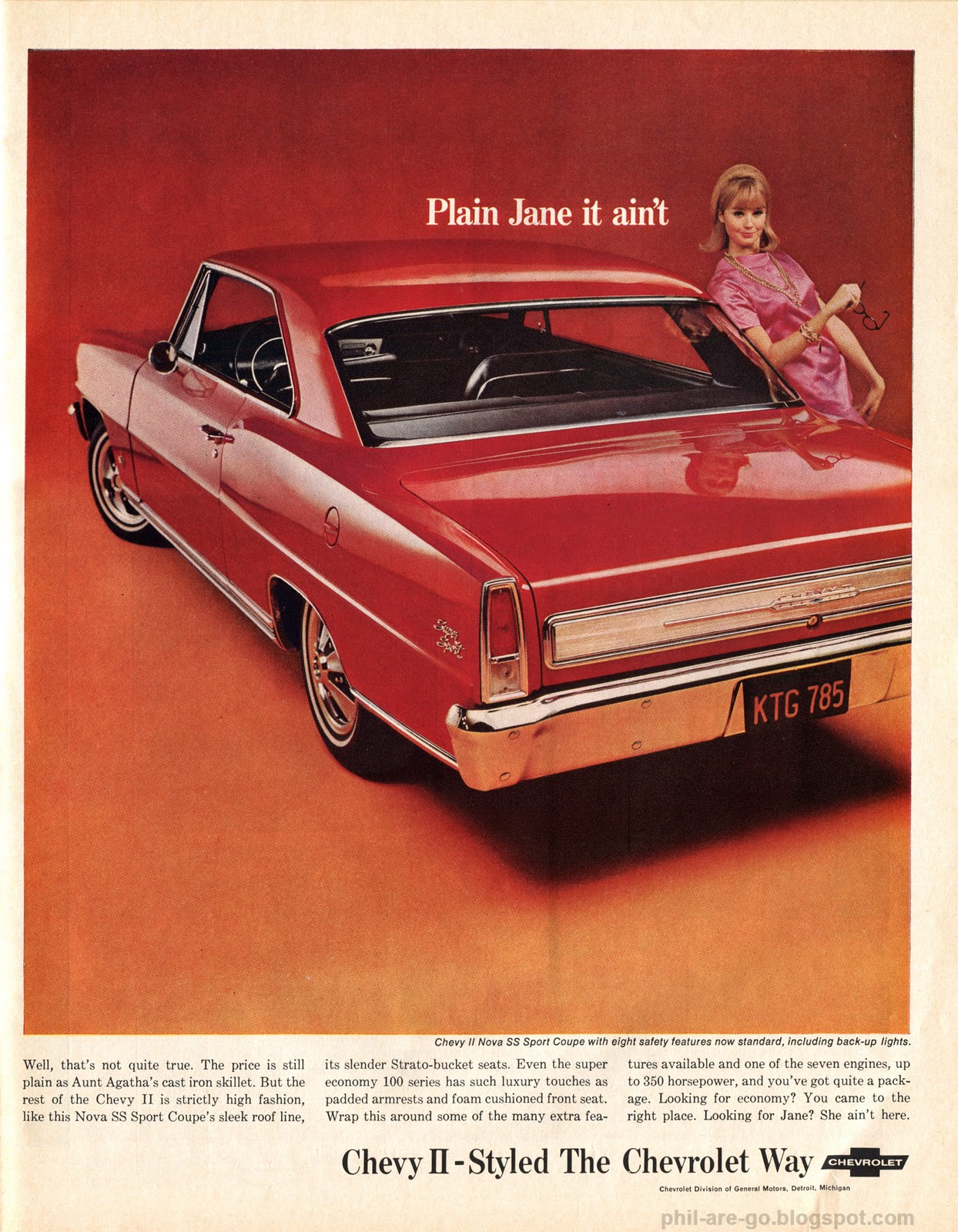
This ad features the 1966 "Chevy II", which was available in a special sporty trim that was called the "Nova". The names are confusing. To a reasonable person, "Chevy II" makes it sound like Chevy only made two models that year, and this is half of them. It's not true, but this is why the name was poorly chosen, if you ask me.
The Nova is still massively popular among hot rod guys because the car was affordable, compact (for the time), and could be had with a pretty huge motor. It was also available in red.
When you're featuring a photo of a red product, you can go one of two ways: make the car the only red thing in the picture, so it pops out, or show the red thing in a red studio, knowing that "more red is better". This Chevy looks like it was shot in an orange (-ish) studio, with a girl in a pink dress. What's the plan? Analogous colors. Some basic color theory is needed to explain, but it won't be too painful.
You may remember the "color wheel" from grammar school. The primary colors - red, blue, and yellow - are arranged in a triangle, with the combinations of those colors placed inbetween them, forming a circle. The Chevy is red. Ad men know that red means excitement, danger, violence, and fun - everything young people want in a car. The art director for this ad included colors that are neighbors to red on the color wheel (analogous). This keeps the ad nice and "hot". Orange, pink, red.
Starting with red, moving counter-clockwise around the wheel gives you oranges. Go the other way from red and you get pinks and purples.* Since the car is red, the pink dress and orange floor "frame" the car, who is the star of the show. All these colors make your brain feel excited.
Does this influence car sales? Probably not, but artists really get off on it, and it helps the art director justify his/her sky-high fee for designing the ad. There. Now you can skip the first semester of art school. You're welcome.
 |
| Click for the big. |
*These colors result from mixing
paints or
inks in this way. Mixing colored
light works by a different set of rules, which is why your TV has a set of RGB (reg, green, blue) connectors and not RYB (red, yellow, blue) connectors. Understanding this is quite a kettle of fish, and requires a degree or two in physics.


2 comments:
Thanks for sharing the knowledge. I am glad I didnt miss class today.
If I had this ad open in Photoshop, and I started to slide the 'hue adjustment', would I essentially be moving the colors around the color wheel? For example, would there eventually be a yellow-green car, a green studio and a yellow dress?
You got it. The colors just go round and round. When you have the HUE/SATURATION dialog open in PS, you'll notice that, if you drag the slider all the way to the left, then all the way to the right, your picture will look almost the same at either position. It's a little deceptive that they display the HUE adjustment as a linear thing when it's more like a circle.
Thanks, Fil!
[-Mgmt.]
Post a Comment