7/31/12

Okay, some more job opportunities.

Alert Reader Steve Miller sent in this critical career posting in the field of Potatoing. Don't miss out on this several-in-a-lifetime opportunity to begin your new life in basement potato chipsmanship. Send for free potato. Just pay $3 shipping and handling. Thanks to Steve for bringing this to our attention!!!!!!!!!!


Or do this thing: draft! O. C. Miller will teach you to make "huge plant or immense building" take shape. Weird Hitler baby moustache optional (interchangeable with bow tie). Lobot haircut mandatory. Clearly, the lucky graduate has learned the most important lesson: that the key to addressing O. C. is to avoid look at him. Write for FREE bulletin. O. C. Miller, secretary, professor, comptroller, janitor, front stoop sweepsman.

UPDATE! This just in from the P.A.G! Geographic & Temporal Telemetry Squad. Waaaaait a second. What's with these guys' names? O. K. Miller and O. C. Miller? Double you Tee Eff? Same guy? Same guy who remarried and took his wife's name? Twins of unimaginative parents? What's the connection? We're through the looking glass here, people.

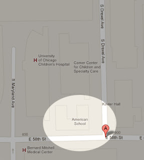
 Both locations are nowhere near each other. The Potato Institute was located on the North side, near a restaurant and some convenient and safe public parking.
 The Potato Institute location.
View Larger Map

Holy flaming shitballs! The American School is still there at 58th and Drexel (street view not available)! A quick Googling of O. C. Miller's name shows that he's all over the American Correspondence School's history. He's a real guy.

No joy on O. K. Miller's name, except for this fan fiction of Mystery Science Theater 3000. That's about as weak as any evidence I can imagine. O. K. must have lived at some apartment in the area or something. Or, it actually is O. C. Miller, except that his middle name was Clark and he sometimes spelled it with a "K".

SO! A conspiracy of coincidence and unrelated nothingness! I might have known. I'm having the Research and Googling team flogged for wasting my time.


Click for big.

Click for big.


7/30/12

Little Ads - Perfectly normal career opportunities for everyone normal.

"John made $42.50 in one day in his new genetic replication business." Barbara told herself.  Get into this new business now. Be several of your own boss.

Learn this profitable profession in 90 days at home. Massage your lovely female conjoined symbiote growing from your pelvis. Possibly massage others' symbiotes. Opportunities abound! Send for free catalog stuck through another catalog.


Learn public speaking the Adolf Hitler way. Learn fist-shaking, fist-quivering, tiny moustache-having, Poland-Invading in spare time at home.


7/26/12

Breeze Soap - Timmy and Bev

Timmy and Bev spent the afternoon out in the garden. How could they not? There was a breeze today, and they both felt thrillingly all-over fresh. It would simply be madness not to frolic out in the breeze with the plants. Mother would approve.

"Where shall we luxuriate first, Bev?" asked Timmy. "Oh, don't make me choose, Timmy! The garden is ever so wonderful today! I feel simply limb-fresh just looking at it all! Let's caper near the flowers!"

They capered near the flowers. Their all-over freshness was thrilling. They thrilled there as was their wont, allowing the breeze to toss their hair. It made them laugh. "Won't mother be cross with us that we mussed our hair together, Bev?" "She would, Timmy, if she thought we weren't country-fresh from top to toe. As long as we have Breeze, mother knows our skin has the sparkle of spring, and that's the most important thing of all!"

Timmy closed his eyes to let his eyelids enjoy some of the breeze, and when he opened them, Bev was not to be seen. "Bev?" he called. "Where have you got to?" Timmy became concerned for just a short moment, but then, as he turned about, Bev's head popped up from the rose bushes. "Surprise!" Bev shouted. "Oh!" Timmy cried. "There you are! What a tricksome sister you are! Tra-la-ha-ha-ha-ha! What a great jig you've played on me! Fa-la-la-ha-ha-ha!"

They laughed together in the roses. "Do you know, Timmy..." asked Bev, "...I don't think I can come out of the roses. They've all snagged my coat! I think the flowers are a merry trickster too! Fa-la-la-ha-ha-ha-ha!" Timmy chided the roses "Oh, you naughty roses. You let my sister go. You're ever so fiendish. really you are! Aah-ha ha ha!"

They both laughed in the breeze, and in the flowers. They laughed ever so hard. The flowers tore at Bev's coat, and at Timmy's sleeves as he tried to get Bev out. Then the thorns tore at their skin, which had the sparkle of spring. The breeze was so fresh! The more they struggled, the more they got scratched by the rose thorns. There were little drops of blood from finger tip to finger tip. They had to pause to catch their breath. They were becoming woozy.

"I say, Timmy," Bev said, "with so many scratches, we'll look like we've been in The Wars! Won't mother be frightfully worried if we don't come in for afternoon tea?" "I should say not, Bev" Timmy reassured her. "There's never been a soldier so confident and country-fresh as us!" "Oh, Timmy! You delightfully clever boy! What a grand, grand joke! Tra-la-la-ha-ha-ha-ha-ha!" Bev liked this joke ever so much and laughed together with her brother in the garden breeze, struggling, laughing and bleeding in the flowers, until it became dark and the fire brigade came.

Click for big.


7/25/12

Edw. G. Budd Manufacturing Co. - Stain-less design.

This ad was found in a copy of Fortune magazine from 1936, the publication for industrialists and the horsey set. Basically, this is the magazine that the guy in the Monopoly game would have read. And since it's 1936, every page is covered with proof that Art Deco was just about the most beautiful thing that humanity has ever created. Don't take my word for it. Just look at the proof, then admit I'm right. Ho-lee crapola.
Better people than me have tried to explain what art deco was, and if you're foggy on the concept, there's gobs of places you can read all about it. The Wikipedia article kind of hits the nail of greatness on the head with this: "At its best, art deco represented elegance, glamour, functionality and modernity." Testify. This is why art deco was influential all the way from earrings to trains. The whole "beauty of function" thing makes it obvious why engineery types can easily get all misty when confronted with an especially deft piece of deco, like this Budd ad.

Before I forget to mention, check out the way they laid out the body text in the Budd ad. The weird paragraphs of alternating italicized type for no reason? This looks like the wanted posters from the 1800s, with ONE HUGE LINE OF TEXT and then a few lines of tiny text in a different font CLOSELY FOLLOWED BY MORE IRRATIONALLY HUGE LETTERS FOR no reason. It's like a ten year old who just found out how to change fonts in Microsoft Word. I could be wrong about this, but it's kind of odd how this Budd ad straddles the fence between modernism an antiquity.

Deco was typified by simple geometric shapes and stark colors, which can be useful if you're printing in black and white. Keeping the colors limited to very dark darks and very light lights makes for an eye-catching ad. Often, you'd also find a lot of energetic diagonal lines, like the lines of text in the Budd ad. Note that the text goes up as you read from left to right. Also, the train is heading towards the top of the page. It's no accident, as this subliminally communicates optimism to your brain, whether you notice it or not. This kind of belies the overall dark and non-cheerful colors in this ad. To my mind, this is decidedly characteristic of art deco. Intense, semi-scary tonality, combined with super strong and optimistic shapes. The contrast is beautiful and sometimes unsettling.
Unfortunately, this also was the visual language of WWII propaganda posters, some of which got downright freaky with their blow-the-shit-out-of-em messages. War. Uh! Good god y'awll!

Deco was just the prevailing style of the time, and actually predates dubyah dubhay eye-eye by a good ten or twenty years. Still, it could have easily been smirched with the stink of war forever, due to guilt-by-association. But you can't keep a good design down, and it has remained a favorite. Hell, it's even survived a kind of retarded revival in The Eighties, what with the repeated shapes and cheap-to-produce geometry that polluted every common room in college dorms throughout The Nineties. The Eighties is the mouth-breathing cousin of our favorite idiot decade The Seventies and there's almost nothing it can't ruin, except for art deco.

Hey! Check it out. Budd manufacturing is still around, and they're mostly doing the same kind of stuff, although they're now ThyssenKrupp Budd. The Wikipedia entry sort of reads like it was written by the ThyssenKrupp marketing department, so, grain of salt time. Still, it's good to see them still rocking the steel biz over in Michigan.

Where has deco gone? Nowhere. Something this good doesn't just vanish. It finds it's way into everything. so you don't notice it. Most smartyphones have the perfectly radiused (perfectly rounded) corners and minimalist design of deco, as well as pretty much everything that Apple and Ikea sell.

If you like the fonts in this ad, go to your favorite free font site of choice and look up Two Cent for the "profitable performance" text at the top, and City medium or Rockwell for the stuff at the bottom. Just don't forget to make your text change font for no reason and become RANDOMLY GIGANTIC and bafflingly small. Otherwise, you'll never catch those gall dern Dalton boys.

Click for big.


7/24/12

House of Hazards

Joke #1 - In the fall of 1956, the Milwaukee Fire Department began experimenting with evil. Here we see a model of their proposed House of Hazards, whose success paved the way for their Chair of Treachery, Pencil of Peril, Dog Bed of Danger, Roundabout of Risk, and Washcloth of Woe.

Joke #2 - "Well, Mr. Hazards, I think you may want to consider changing the name of your hotel before you break ground."

Joke #3 - "Now, the full size House of Hazards will have real smoke, instead of cotton fluff, heh heh, but all the other details are accurate. If you and your wife approve the design, we can start building immediately and your family can move in as early as January. Sound good?"

Joke #4 - "Ah, there's your problem, see. Looks like your dolly was smoking in bed. I recommend you evict her immediately and replace her with a nice safe Evel Knievel action figure. Hmm... He does have drinking problem, though..."

Joke #5 - Ironically, the shoddy wiring in the Milwaukee Fire Department House of Hazards teaching aid burnt the structure to the ground mere hours before it's debut at the Safety Fair. Subsequently, an even smaller model of the model was built, to help demonstrate how future models of houses could be made safer.

Joke #6 - "See, Mr. Mayor? If only real houses were three feet high, had no walls, and were inside our fire department, we could virtually eliminate all fire-related property loss."

Joke #7 - "This switch turns on the orange lights, to simulate the fire, and this one here make the little people scream for help and jump out the window. This weekend, Bill will be wiring up our Domestic Abuse sound effects. We told him we didn't need it, but he really seems to be into it, for some reason."


[Commenter jokes will be added to the post.   -Mgmt.]

Click for big.


7/23/12

1966 Ford Fairlane - Lengthening stripes.

There are loads of places on the web to read about Ford Fairlanes and how super bitchin' it was and great it would be to find a mint example in a barn blah blah whatever. All true, and done to death. This post is about what a good looking ad this is.
Mostly, the layout here is about asymmetry. Big graphical feature on the right (the stripes) offset by the huge black negative space on the left (the huge black negative space). Not much going on at the top of the frame (geometric shapes), but lots of interest focused at the bottom (car and babe).

Asymmetry can be an acquired taste. When your brain is left on autopilot, or if you're a toddler, it will tend to line things up in the middle, so that the left and right sides of a design are nearly mirror images of each other. This is sometimes beautiful (the Taj Mahal, if that's your thing), but very often it's boring as hell. Asymmetry is a mild irritant to your eye, but handled skillfully, it can be infinitely more compelling and interesting than just centering everything along the prime meridian and calling yourself a genius. If you want, you can make an analogy to seasoning in food. Eat a spoonful of curry powder, and you may never want to eat anything again. Eat a plate of Chicken Tikka Masala and the idea of ever using your mouth for anything but eating Chicken Tikka Masala may seem like madness.

In second year art, you learn a few things about balance. The long and the short of it is that, even if a composition is not completely symmetrical, there can still be perceptual balance. Five small squares can have the same visual weight as one huge square. Stuff like that. And so, you can have balance without symmetry.

In this ad, the top area of the image can be said to be balanced, even though it's not symmetrical. The visual detail of the black and white stripes on the right has about the same presence as the huge black area on the left. Neither can be ignored by your eye. The same goes for top-to-bottom balance here. Loads of detail at the bottom, contrasted against not-much-going-on at the top. Your eye is drawn both to detail and to large simple shapes. The fact that both are presented here in heaping helpings keeps your eye running laps around the page. Starting at the car, you may run up the right side, following the stripes and dive into the black space. But then you notice the little white figure of the woman poking up into it, so you go and check her out. The leads you back to car territory, to repeat the whole thing again until you get bored and turn the page, or run out and buy a Fairlane.

At least, that's the hope of the manufacturer.

Click for big.


7/20/12

Gulf Oil - Mister smooth.

How about a baffling oil ad to start your weekend off right? "Please don't!" you say? Right you are. Coming right up! Get those eye-holes ready to receive some first-class awkward, post haste!
Visit your too-friendly neighborhood Gulf station for some special attention from the attendant on duty, who apparently has some kind of hernia problem or abdominal injury and like to ride horses. Or something.

Yes, it was a simpler time back then in yesteryear. A woman who (naturally) doesn't understand anything about car thingies could rely on her local Gulf station to take care of her needs. Note to self: have an intern insert a randomly chosen "lube" joke here. Also have the intern insert some kind of "insert" joke here too.
Anyway, please join me in going double you tee eff is with the guy wearing the lifting belt and/or truss putting the moves on a bafflingly receptive customer... with the obvious approval of the station manager? Does the ruptured man with the muck boots work at the station? Is he just a customer? Was he just cleaning out the septic tank and decided it was time for a quick break and some hitting-on? Most importantly, why is Betty Sue INTO HIM? Does this make people buy motor oil?

Come on, The Past! I'm trying to understand you! You're supposed to be all quaint and goofy. You're not supposed to make me want to take a silkwood shower just from looking at a stupid ad. I think we should spend some time apart. I'll be over at The Future's house. It's always just as cool and shiny as I want it to be. It understands me. You're just creepy.

Click for big.


P.S.   Hey. Check it out. This is our 666th post here at Phil Are GO! Creepy groovy. Time for an Iron Sabbath lunch listen. Please make The Corna at will. Rock on. Post on. Run to the hills.


7/19/12

Lees Carpet - The thin man.

Critical carpet advertising update now, from 1949. Newsflash: Lees Carpet ad looks pretty neat, hopefully doesn't contribute to eating disorders.
Jeez, what a nice illustration. It's kind of Disneyish, circa 101 Dalmations or Sword in the Stone or something, which I believe were both produced in the 60s. But this ad is from 1949. Ah well, there's no accounting for temporal art anomolies.

Anyhoo, tall, thin characters can convey elegance and stuff. Rich people like those tall thin cypress trees in their yards. Fashion models are all famously pencilly. Somehow, it conveys poise and grace.

Push the thin stuff really far and you get comedy. In this illustration, you can tell they're playing the thing thing for laughs. The super tall butler bending down to the floor is pretty jokey. He reminds me of the waiter in this scene from The Triplets of Belleville.


And when I saw this scene for the first time, it reminded me of Eric Idle's waiter character from this Monty Python sketch, The Refreshment Room.


And Eric Idle was alive in 1949. He was six years old. Is it coincidence that this ad, produced in Eric Idle's lifetime, features a waiter that so closely resembles a cartoon waiter that sort of acts like a character that Eric Idle would create twenty years later? Of course it's coincidence. Don't be stupid.

Click for big.


7/18/12

No Post Day, sorry for the lack of convenience. Also pizza.

Sorry, everyone. No post today. We're having the offices here at GO! Tower de-updated with some new avocado Formica, orange shag and Masonite paneling. If anyone knows where we can get a hold of a few IBM Selectrics with USB 3.0 ports (Hey, we're not total savages!) please let us know post haste.

In the mean time, please enjoy this painting of pizza I did. It, along with the breakfast painting are from my widely reviled series entitled "the hungry eye". Please enjoy.

[-Mgmt.]


7/17/12

Little Ads - We know Fit from Phonola.

Two non-newsworthy ads today, from the back pages of the Saturday Evening Post! Funny pictures and funny words, it pays to know fit from Phonola.
Ad number first is from Bear Hosiery featuring this really great bear. He's painted with a brush effect with a stupid name: "stipple".


Stippling is a sort of broad term for shading with dots. You can get more specific and talk about pointillism and what have you, but in general, stippling is the technique in which you create the illusion of smooth shading with non-smooth texture. In the case of this bear, the artist worked the bristles of the brush so that they were kind of spread out in little bunches. Then, the tips of the bristles were then dipped in paint and poked onto the paper / canvas / baby's head / parchment / pavement repeatedly to create the texture of the bear. It's a good way of making whimsical art more whimsical and it found a home on lots of cereal box mascots in the fifties and sixties.


Sadly, cereal box art has gone in the direction of imitating the over-rendered plasticy-smooth look of animated CGI kids' movies. Lame.


Anyway, the bear's dot eyes, fat head and skinny nose are also pretty funny. Also, Bear seemed pretty proud of the way their socks fit. You'd think it would be stupid to put a bear in an ad bragging about the way your socks fit on human feet, but bears are one of the few mammals that walk on the pads of their feet, like humans. If you look at the bones in the foot, most mammals walk on their tiptoes. Not bears. They walk kind of like us. I am not making this up. Look it up. NOW who doesn't know how to advertise socks?


Also, bears won't run away just because you open your jacket and pretend to be bigger than you are, just like humans. That's a myth. Bears aren't fooled by this trick and neither are police officers.

Click for big.


Ad number B wants us to buy a "phonograph". Music used to be sold on vinyl discs with hardly any copy protection at all called "records". You could play them on any phonograph you wanted and Apple couldn't stop you. Also, every time you played it, it wore out a little more and sounded a little worse and eventually every record became a Yoko Ono album. Good times.


Anyway, Phonola makes up some hilarious B.S. words to make their phonograph seem fancy. Two speakers = "duo fi". An adapter for 45 RPM records = "magic 45 center". I sometimes wonder if bullshit was invented by a bull or an advertising exec.


This recrod player may have sounded pretty good, since the cabinet was probably made from wood. I have one or two radios that are plastic, like most stuff you can buy now, and the sound is a little uninspiring. Yes, it's possible to make a plastic radio that sounds incredible, but its way easier to make a wooden radio that sounds incredible without having multiple advanced degrees in acoustics and wave physics. Long story short - there's a reason cellos and pianos are wooden. Sorry. I mean "pianolas and cell-o-ramas".

Click for big.

7/16/12

Hastings Piston Rings - Ring around the muzzle.


Aah, nineteen sixty-two. Everything was cool looking and mod. Cars were evolving from childish to elegant. Clothes were trim and sleek. Character design had reached maturity. (Please purchase a turntable and a sacrificial record so you can drag the tonearm across the disc. Do that now.) Then there's the Hastings man.

What the eff? What's with this guy's face? Apart from his catastrophically deviated septum and his mysterious twin neck nipples / melanomas, the real trouble starts below his nose.


This is the part of a cartoon character's face that some cartoonists call the "muzzle". This term bugs me, because "muzzle" should only apply to dogs and perhaps doglike animals, and Elton John (who my art professor used to insist was very doglike in the way he looked and sang). But, there's no better word to quickly point your attention to the region around the mouth and jaw. Anyway, the Hastings man's face is a mess, and this cannot be attributed to any "style of the times".  Character design in 1962 was more like the tailored-for-cheap animation look of the Hanna Barbera cartoons, which means "simple and clean". There's no stylistic excuse for Hastings Man. He's just a shitty drawing.


Fred Flintstone's face had a muzzle. It's the shaded area where his permanent five o'clock shadow turns his skin a different color around his mouth. Also see Homer Simpson. Despite their position in the bargain-basement TV animation market, Hanna Barbera did know the basics of character design. You have to, if you're hoping to animate your character efficiently and on time. Notice how Fred's muzzle has just the one line around it. Now look at Hastings man's multiple concentric muzzles.


What kind of life has Hastings man led to earn a face so wrinkled and tortured? Did he serve in WWII or Korea? Did he ever get to sleep indoors or did he sleep on the surface of the sun, soaking up those sweet, face-melting UV rays? We can only guess, because he's not talking... not with a dainty little mouth like that. That mouth is only good for making little mewling sounds and eating soba noodles.

I have only ever made one immutably true observation about the human condition that, to my knowledge, hadn't been made before. "There is nothing too stupid to become popular." Witness those spinny ghetto wheel covers and the entire career of Michael Bay. In the case of Hastings Man, I feel like we somehow dodged a bullet. We could have been living with characters with pointless concentric mouth lines for over forty years now, but The Sixties thankfully self-corrected this character to the sidelines of advertising forever.  Thank you, The Sixties. Hastings Man is nowhere to be found on the Hastings corporate web site, apart from the "our history" page. Good job there. We must never forget Hastings man. lest we be doomed to repeat the atrocity.


Click for big.


7/13/12

Bostitch Staplers - The new issue is out!

Finally! I've been waiting for the new issue of Bostitch Stapler Adventures for weeks, and the new action-packed issue is finally here! I hope they finally defeat their mortal enemy, Swingline Sam!


In the last issue, we left Andy Phetamine a little worried (but still impossibly happy) how he was going to fasten all his various items together in his flower shop. I lost a bit of sleep myself, hoping things worked out for Andy. Turns out the solution to all his problems was a Model B8 Bostitch Stapler! This I did not expect to see in the pages of Bostitch Stapler Adventures.
In panel one, we can see Joe the garage guy stapling his "sale" banner into the side of a building with a Bostitch B8. Wow! I had no idea a Bostitch B8 could staple concrete. Is there anything they can't staple? Joe knows his stuff. When Andy asks him how he's doing it, he has immediate recall of the manufacturer and model number of his Bostitch B8.


After that, Andy Phetamine (not surprisingly) gets all obsessed with Bostitch staplers. he starts seeing them everywhere, possibly coming out of the button holes on his shirt and crawling all over his body. He has to have one. He proclaims to all both of his employees that Bostitch staplers will now be used for everything they do. Making corsages, fasting his pants onto his pelvis, keeping his eyebrows nice and high, etc.

His (surprising) dot-eyed son wants some credit for noticing that Joe was hanging a sign, naturally. So Andy increases his allowance and further expresses his gratitude with a stapler. Now Dotface can staple too. One of his first thoughts is that he can staple for (very surprising) Mrs. Phetamine.

At the end, Andy recommends that we staple our hand: something that we can't really recommend. You can't hold it against Andy, though. He's got a lot on his mind. Pieces of dirt, fibers of thread, and molecules, for example. Man! I can't wait to see what happens in next month's issue of Bostitch Stapler Adventures.


Hey, you know what YOU need? You need a blank-word-bubble version of Andy Phetamine that you can print out again and again to do all your talking for you around the office. You can have Andy invite people to do things to themselves, or advise them as to which things could use some sucking, or recommend ways in which they may make more appropriate use of your time. You're super welcome!


Right click save, and print print print!

Click for big.