2/28/13

Eastern Drapery Hardware - From the ones who know.

A pointless endorsement now, from our friends back in 1961! Shopping for new blinds or drapes? Trust Bing Crosby and Rosemary Clooney, like all the smart decorators!

When you listen to the Bing Crosby - Rosemary Clooney Show, there's one key takeaway, and it's that these two know about window treatments! You know how all their songs are about windows? That's no accident. Bing and Rosemary were working their way up to their dream job of being cut and pasted into an Eastern Drapery Hardware ad. It just makes sense, people. Whenever you see a famous person doing a paid endorsement, you should always assume they're personally concerned about your buying choices.

Actually, Eastern was just a sponsor of the show, and part of the deal must have been that Eastern can use the stars' likenesses in their ads. Stupid reality. I was happier imagining Bing and Rosemary working in a curtain factory.

Click for big.


2/27/13

Supplementary Sidebar - The Cord Cutting Chronicles, Pt 2. The Dawn Breaks, or, The Night Dawns on Comcast.

So, back in December, I took advantage of the ridiculously good and cheap crop of television options we now enjoy and got a new one. It's a Samsung, which got great ratings for picture quality and horrible ratings for it's "smart TV" functionality. Since I was cable-cutter-curious, I figured the "smart" part of the thing would be enough to satisfy the part of me that wanted to give cable the finger, which, truth to tell, was most of me.

I had done some research, and knew that almost all of my must-have shows were available through either Amazon Instant, Hulu, or both, just with (with some shows) a bit of a delay between first-run air date and the episodes' appearance on the streaming services. Bummer, but getting Top gear six months earlier than Hulu was not worth $1200 a year.

Desired shows: (Mix of free and not free, depending on newness of episodes.)
-Top Gear
-Walking Dead - Getting a little slow and tedious in its budget-cut 3rd season. Can live without it.
-Breaking Bad
-Game of Thrones
-How It's Made - Equivalent shows are all over the place on the streaming services.
-Mythbusters - Not available streaming, but the show is getting more and more scripted and lame.
-Wheeler Dealers - British car restoration show. Not available streaming. This one really hurts.

Adding up the cost of the infrequent seasons of the shows I would happily pay for, it's still less than the $150 per month I've been paying. Most of the time, when I flick on the TV, it's a rerun of something I've seen anyway. Any yes, I'm one of those tree-killers that turns the TV on while cooking, or working on the computer and stuff. When the house is silent, the voices come. We don't like the voices.

Found shows I wasn't looking for on Hulu Plus: ($10/month)
-International news from all over
-Numerous nature shows
-Loads of obscure anime
-Lots of guy brain-candy similar to How It's Made and Really Huge Bridges, or whatever.
-Lots of documentaries
-Weirdo B-movies I've never heard of
-Actual movies normal people would want to see
-5th Gear - Another British car show only slightly less good than Top Gear

It's pretty cool pressing a button on your remote and seeing a whole new screen filled with Netflix, Amazon Instant and Hulu logos, along with Samsung's idea of a home page. As it turns out, Samsung's idea of a home page is this: Start adding logos to click on, and when the screen gets full, make the screen slide left and right. This is a lesson that everyone else in the world learned was a bad idea back in 1998, in the prehistoric years of Web 1.0. Anyway, Samsung has been concentrating on making TVs all this time, so maybe they get a pass.

Since I was already an Amazon Prime member (something like $60 a year gets you free two day shipping on lots of things, and also includes free streaming content like movies and TV shows), I tried watching a few episodes of Top Gear. The thrill of watching something through an artery other than Comcast's main vein quickly wore off when stuttering and disconnects happened with disappointing regularity - about every 5 minutes. "TV has no internet connection. Please check your settings." Since I wasn't using wi-fi to connect to the web this was surprising. I had a cat 5 cable stuck in the back of the TV and my modem and router were doing nothing else at the time. How could there be traffic problems? I wondered if Comcast was throttling my connection, or I had reached my monthly data ceiling or something like that. I had never had to worry about streaming video before, so these were both possible.

Fast forward to me on the horn with a Comcast worker bee who verified that I had 15 megabit per second of download speed. I had done enough homework to know that services like Hulu recommend no less than 1 megabit  download speed, and I had 15. That shouldn't be a problem.

I could taste the streaming content cake, but it often disappeared mid-chew and had to be re-bitten over and over again with only the occasional swallow. What was to be done?

Coming soon - What was to be Done.


Admiral Color -The neighborhood watch.

Televisions are currently ridiculously great and cheap right now. Standing in line a Target recently, I saw a pallet of name-brand 42" high def LCDs for about $400. What you get for your money now is just kooky, considering I can recall buying a 32" CRT in 1996 for something like $700. The crane required to get it up to my second floor apartment was not included in the price, or the cost of reinforcing the Earth's crust in the region, to keep the TV from falling to the center of the planet. Good picture, though.

What I do miss, however, is TV cabinets like this old Admiral.

See, now that we can make televisions with hardly any bezel (the "black frame" part of the TV around the screen) and thinner than anyone really needs them to be, we absolutely are. This is cool and makes product managers all moist in the trouser region, but I think I have space in my house for some kind of hilarious hybrid, like this Admiral with a big LED-backlit LCD in there, instead of the old glass tube screen. Sure, you'd have to cut out some of the vertical slats on the sides, due to the wider screen aspect ratio, but that's not horrible, and it would still leave room in there for some great speakers.

Of course, there's not enough of a market for this to be worthwhile for any real company to do. It will have to be pulled off by one of the insane hobbyist proletariat to pull off. If I came into possession of an old console donor TV like this one, I think I have the carpentry skills to totally make this happen. The LCD implant wouldn't have to be modified in any huge way. I'd just need to build into the console a kind of wooden bracket to hold the LCD in there without its stand on. The trick would be including an amplifier to drive the speakers without it needing to be separately controlled via remote, which would require line-of-sight for the infrared to work, and, hence, visible to look at. Hmm. Fun to think about.

Anyway, what's on tonight in the Admiral ad? Looks like Weird Head Scarf and Hat Lady again. Damn, it's a rerun. I saw this one before. It makes you wonder why we bothered to drag our Admiral out onto the driveway to share with the whole neighborhood. Oh no. Those headlights coming in from the left. Dad's back from the bar and can't see straight! Noooo! Not the Admiraaaallllllll!


Click for big.


2/26/13

Supplementary Sidebar - The Cord Cutting Chronicles, Pt 1

Herein, find the chronicle of a man yearning to invite Comcast to remove their straw from his checking account. I've been a Comcast subscriber for basically 18 years, and the price of having a 600-channel spigot of raw entertainment leaving puddles of excitement, hilarity, and adventure on my carpet has risen just slightly faster than the subjective value of those puddles. My channel lineup includes over 600 channels, but I doubt that anyone really watches more than six or ten, unless they're unemployed, or a shut-in. By my reckoning, to actually use all 600-something channels, I'd have to house a random selection of 900 people, each watching television for sixteen hours a day (assuming they slept for eight hours per day and they all ate and excreted in front of the TV). I'll go out on a limb and say that those 900 people would have access to all the entertainment they can stand, but that they wouldn't necessarily be entertained. Also, my aforementioned carpet couldn't handle such high-frequency excretion.

What was fifteen years ago a sixty dollar monthly bill has ballooned up to a $150 monthly bill. Mitigating factors include the addition of broadband internet, HD fees and additional channels which, admittedly, I called and invited into my home. However, Comcast's decisions to spread similar content throughout different tiers of channels isn't a mistake or something I can control. If, for example, you like sciencey programming, you'll find yourself paying for tens of channels worth of sports, cooking shows, and at least one channel solely dedicated to reality slapfight mind poison types of content that you aren't interested in, just to get several channels you do like. Sometimes, Comcast migrates a favorite channel into a new group of gotta-pay-extra channels, for your satisfaction. It's also worth noting that the sports channels are the single most expensive type of content for pay TV providers to license from the NFL, NBA, etc. If you have pay TV, you're paying for at least a few sports channels. I hope somebody in your house likes to watch sports, because you're paying extra for them, like it or not.

Please enjoy the following metaphor to help you understand what a massive prick cable providers are:

If a grocery store worked the way cable TV does, you would walk into a store after navigating a labyrinth, with a one in three chance of finding yourself re-deposited in the parking lot. After your second attempt at the door labyrinth, you hopefully would have memorized it and managed to gain access to the actual store. Hoping to buy oranges and paper towels, you would be confronted with a helpful sales associate. "Oranges?" the sales drone would drone. "Sure, those are in produce, but you'll have to buy some folding chairs, a greeting card, three different kinds of lettuce, some ground beef, two tablecloths, and an ice pick." That's our 'Produce Lover's' Tier of products. For paper towels, you'll also get a three pack of cigarette lighters, some bread (not the kind you like), carrots, squash, shoelaces, a set of picnic spoons, two bendy straws, one more birthday card, instant coffee, and a Chinese made yo-yo that's way too light and flimsy to develop any kind of rotational momentum and is essentially worthless. That's our 'Basic Starter Pack'. It's a great value." The total price for your oranges and paper towels purchase would come to $126.32. You would then take your recently purchased ice pick and ram it up your nose because you no longer want to live in a world this stupid. However, if after this shopping ordeal, you were still thinking really clearly, you'd use the ice pick on the sales drone. "Ow, the cavity where the remainder of my brain is!" the drone would drone. "That's one satisfied customer" you'd rasp to yourself, and then stride confidently away from the store, unflinching, as it explodes in a slow-motion ball of flame for some reason. See? I know my basic cable Saturday afternoon classics.

Coming soon: The Dawn Breaks, or, The Night Dawns on Comcast.

1965 Rambler American - Leave a light on for it (in your garage-shaped heart).

Before you mourn the loss of the Rambler brand, makers of the pretty thing in this ad, remember that they're not really gone. They were owned by AMC, which is now owned by Chrysler or Jeep or something. Still, modern cars tend to be swoopy drippy things with headlights that smear around the sides of the nose and onto the fenders. Now you can mourn the loss of the clean lines of the Rambler.

Rambler was a "compact" brand. This car doesn't look all that compact by today's standards, but the standards were different in 1965, and besides, the sharp corners tend to make a car seem bigger than it is. Cute car. Kind of dorky looking, and it's not one of those see-them-everywhere attitudemobiles like old Mustangs, Camaros,  or '57 Chevys.


Well, dry those no-rambler-having tears, you! Here's one on eBay that looks a lot like the one in today's ad! Good luck sleeping tonight, knowing that this car may be resting its head in someone else's garage tonight. I know I won't (find it easy to sleep, that is. I'm not going to sleep in someone's garage, or if I did, I wouldn't let that be decided by an eBay auction).

If you can't win the auction, you can always have this PNG of the star of today's post, lovingly pen-tooled out of it's natural halftone pattern habitat. Windows were made transparent at no extra charge. Get your rude finger ready to right click this little charmer into your personal multicar pileup in three, two one... you're welcome.

Click for 1400 px wide.


Click for 400 px wide.


Click for big.


2/25/13

Kent Cigarettes - The white man's burden.

You've had a hard weekend. You deserve a break. So, pull up a white crate and take a load off in your white seamless void while your white wife serves you a pure, clean Kent, you massive honkey.

It must be hard to design ads for cigarettes. There's no appealing to the consumer's better judgment, or rationality. All you can do is remind the consumer what cigarettes offer them, assuming they're already addicted to the product. Trying to get a non-smoker excited about the "taste" of something that smells so undeniably foul is an uphill battle.

So what can you do? You can make the product seem clean and pure - like the pure enjoyment they'll get from smoking a nice mild Kent. No color says "clean" like white. White psych wall. Check. White props. Check. White wardrobe. Check-a-roonie. White models. Oh, you bet that's a big check! This is 1965.

"Put that out, you handsome devil!"
This ad features Watrick Parburton as The Smoker - a hard-working husband taking a break from re-painting the featureless white void he populates with his adoring servile wife-being, who takes no greater pleasure in life than getting on her knees to light her husband's Kent.

It's interesting to note that they had to paint in a flame for the lighter for a few reasons. Reason number A) The pose probably took a while to get right, and the models were surely holding this position for a long time. They didn't really want to burn the cigarette, so the lighter probably wasn't lit. Reason letter 2) Photographing a flame in a white studio with several thousand watts of light would be nearly impossible. It wouldn't show up. Notice that the yellow flame is slightly darker than the white background. Flame is always a light source. It can't be comparatively darker than the background it's photographed against. Shot against white, flame is nearly invisible.

I used to run into this all the time at the cartoon studio I worked at. We did a lot of girly toy commercials. I was the background painter (you know: scenery for cartoons). The client would always want the brightest colors possible in their commercials, usually pinks and purples. The sky was always the brightest blue (or pink) you can imagine... so much so that it was almost white. Then, we'd have to add pixie dust or sparkles of some kind for the animation. Trouble is, stars and sparkles and stuff are always a light source. They have to be bright or they just look like brightly colored insects or jacks or something. So, the client would complain that the sparkles didn't show up. Then I'd have to patently explain (or sometimes not) to our producer that the background was too bright for the effects to be visible.

I don't think we did this commercial, but we might as well have.


The real world has an infinite range of brightness that your eye adjusts to automatically. Think walking outside on a summer day, coming out of a dark house. It takes a few seconds for your eyes to iris down. Video and computers only have 255 levels of brightness. Everything has to fit into those 255 levels somehow. So, time and time again we'd have to make the magic tinkly sparkles darker than the nearly-white sky. Long story short, you can't have night without day, or light without dark. You can, however, have a smooth filter and great flavor.

Click for big.


2/21/13

The fall girl.

Joke #1 - Fortunately, Little Julia's insurance agent saw her fall. He offered to help her up... for a price. Of course, he would have no choice but to charge her a little more per month for his services, now that the company knew she was a "fall risk", even though she had been a policy holder for years and had never made a claim before, having already paid thousands of dollars in premiums and received basically nothing in return. Also, she had scratched his bumper with her baby carriage when she got herself backed into by him, and she would have to pay for the repairs. But, at least she had him to look out for her.

Joke #2 - Julia had fallen while pushing her dolly's carriage up the curb. Her knees hurt ever so much, but not half as much as when the man from the "D.C.F.S." came along and told her she had to give up her dolly because she was an "un-fit mother", whatever that was.

Joke #3 - Ralph Nader, exposing the dangers of poorly-designed strollers for his hard-hitting book: "Unsafe at Nanny Speed".

Joke #4 - "Julia was unhurt, but awfully shaken up after taking a tumble on the curb. Thankfully, the nice engineer happened by and explained that her endo was the result of inadequate suspension travel, and that she should re-tune her stroller's suspension setup for 30% sag, and that if she upgraded to shock with speed-sensitive valving, she could back off the rebound damping a little bit, so that the suspension didn't "pack up" over high frequency stutter bumps, all without bottoming out on big hits like that curb that threw her just now. What a nice man he was."    -Excerpt from "The Mountain Biker's Radical Compendium of Sleepy-Time Beddy-Bye Stories for Gnarly Little Hammerheads."

Joke #5 - Mitt Romney, explaining to a lazy 47-percenter that it's really up to her to get up on her own and dust herself off, because her problems are none of his concern.

Jim D. Delivers joke #6 to us, skidding to a stop in the middle of the intersection. Thanks, Jim! - "Please Mister, just play along and tell 'em I swerved to avoid hitting a kitten! One more DUI and Human Services is going to take Dolly away!"
[Commenter jokes will be added to the post.   -Mgmt.]


Click for big


2/20/13

Spot the Joke - Fitting room, cannibals.

Today we bring to your eyeballs two more challenges to your sense of lack of humor. Please spot the joke in the alleged "comics" from a 1965 issue of The Saturday Evening Post, the weekly journal of the 20th century's most conservative and absolutely straight-laced Americans. If there's one thing we've learned from Fox News, it's the conservatives' legendary sense of humor. Please join The Phil Are GO! Joke-getting Assault Squad, our blue ribbon panel of the most charitable and sympathetic laughers, in trying to figure out what exactly is the joke in these seemingly unfunny cartoons.

 Theory #1 - The young woman is an employee at the store where she is trying on dresses, and her shift ends at 5:45. She should be out on the floor moving product and assisting customers, not trying on the inventory. This is funny.

Theory #2 - The younger woman is a paid assassin, hired to kill someone at precisely 5:48. Through careful practice and training, the assassin knows that it will take her exactly three minutes to reach her position, assemble her sniper rifle, and liquidate her target. So, she needs to finish picking out a dress before then. Ironically, her target-to-be is the very woman that is helping her with her dress purchase. This is funny.

Theory #3 - The woman trying on dresses is a stripper, working at a nearby gentleman's' club, and her shift begins at 5pm. Despite the fact that her profession involves taking off her clothes, she seems preoccupied with buying the right dress. This is apparently funny.


Theory #1 - The explorer's mother had a long and illustrious career - more so than her son. The natives know of his famous mother's fame. This is funny.

Theory #2 - The natives are worshipers of Cheeksa, the Polynesian goddess of buttocks, and they are performing her salute to the explorer who seems to have The Divine Ass-print on his chest, indicating that he is favored by Cheeksa. This is funny.

Theory #3 - I didn't know that the expression "saved our bacon" existed in 1965. This is funny.

Theory #4 - The natives believe that the explorer must be their mother, and since they live in a matriarchal society, they prostrate themselves before him. Unexpectedly, the natives living in a remote jungle village can read English, This is funny.

Theory #5 comes to us from Jim D. Thanks, J. Dee! - The natives are one of the Lost Tribes of Israel, therefore ANYONE'S bacon would be safe in their presence! FUNNY!!!!!!

[Commenter theories will be added to the post.   -Mgmt.]


2/19/13

Glidden White Lead Paint - Them were the dayshhhh.

Hey, nice painting, Nineteen Thirty-Six! I'll bet you have some lead in the paint, as well as the house it was painted in. hey, you don't look so good. How's your brain feel? Maybe you should sit down.

Glidden wants you to know about the wonders of white lead. It's why their paint sticks to everything... wood, concrete, your central nervous system... It could be argued that in '36, we didn't really know how poisonous lead was. It could also be pointed out that the Greek botanist Nicander observed "colic" and "paralysis" in people poisoned by lead as early as the second century B.C. But don't blame Glidden. If there's money in it, any company will make you just as sick as the law allows.

While lead paint can't be legally made in America any more, there is still loads of the stuff in production around the world, in countries that we may politely describe as "provincial". America's test scores are bound to get (comparatively) better somehow, right?

Don't think that modern paints are somehow worse than good old heavy paint. They're probably as good as, if not better than, lead paints of yore, what with our knowing and doing of chemistry and stuff... until someone finds out that knowing and understanding things is somehow poisonous. Then we can all happily eat lead sandwiches and become happy.

Click for big.


2/15/13

Chicago Automotive Disappointment Parade lack of coverage, Day Number Final - Some more!

More recently unearthed pictures from Chicago Disappointment Parades of years gone yore, courtesy of alert reader and fellow eye-candy hoarder Steve Miller (apparently). Behold the wild designs of car designers cut off the leash... and then rapidly re-leashed before anything interesting was actually put into production. See the booth babes of ages past! Wonder how old they must be by now! Take a Silkwood shower because you feel dirty inside!

The 1950 Nash NXI, surprised by an unannounced visit from the company brass.


Despite the rather more conservative air of 1951, you can tell she's a booth babe because no human would ever voluntarily hitch up their knee so awkwardly on a car high as her belly. A double-jointed hip was an asset on the resume of a 1951 Crosley booth professional.


k

Design genius Harley Earl's visual opus of restraint and minimalism, the 1953 LeSabre concept car. A design so ahead of it's time, we wouldn't see anything like it again for another forty years (see below).


A scandalously-clad booth babe in the Muntz booth, 1951. You can see her ankles!


1956 Packard Predictor, still can be seen at the Studebaker National Museum in Indiana. I'll just remind you that Studebaker also brought us the oddly displaced-in-time Avanti. Why do the good ones die, while the survivors are nearly indistinguishable?


Hey! a '59 Toyota! It may have been a little early for Japan to push their Japanese-ness so hard with the kimono and all. According to Steve Miller, "In 1960, the kimono was gone, replaced by a typical American girl-next-door in a typical American girl-next-door gown."


2/14/13

The '65 Plymouths - Frolic in the bucolic.

Our exclusive lack of coverage of the 2013 Chicago Automotive Disappointment Parade continues with this extra-big two-page ad for the 1965 Plymouths. Go drive them in the park and be weird with your girlfriend/wife/secretary, won't you?

There was a time when I would have thought these old domestics looked boxy. But, now that we have the new Cadillacs to show us what real boxiness is about, these old Plymouths look positively sleek. I won't show you a picture of a Cadillac. They're everywhere. Go look out a window. there's probably one in your front yard right now, but it could easily be mistaken for a building. God, I hate them (Cadillacs, not buildings).


Anyway, today is Valentine's day; a nice day for you to take your sweetie out to the park in your Belvedere and make her do this... unless you like her... and unless you like the parks department, which probably doesn't like you driving your Belvedere all over their nature and stuff.
"This is what I'll look like on my way out the door the day I divorce you!"


It's good to be health conscious. You want your significant other to feel secure that you have a long life ahead  of you. Here, Pat Boone checks his girlfriend's nose for nasal displasia, while the flora checks him for polips. Good to know!

After using the park in this way, please be courteous and
burn the whole place to the ground.


Click for big.


2/13/13

Chicago Disappointment Parade - From the mists of time.

Some previously unlooked photos have washed up on the shores of The Present... flotsam of the swirling eddys of the universe of spacetime of auto shows, and from a time when it was so long ago we didn't even know what year it was. They're from 1953, '54, '56, and '60, and they were sent to The Present Day by alert reader and temporal adventurer Steve Miller. Thanks, Steve, whenever you are! Watch out for those rascals Hitler and Rasputin.

The Chicago Automotive Disappointment Parade of 1953. Chairman of the Show, Prolapsed Pete, showcases Ford Motor
Company's answer to the desirable compact imports of that year, the Ford Thundersqueak. In this photo, he is about to
remove his pelvis and three vertebrae, prior to entering the vehicle. Fortunately, the Thundersqueak had a convenient
pelvis hanger for temporary storage while riding in the car.


At the 1954 Chicago Automotive Disappointment Parade, future middle class trickle-downer Ronald Reagan proudly endorsed the 1954 Oldsmobile Eighty-Eight. The design for this model would remain unchanged until 2001, when a steering wheel was added.
The famously traditional Oldsmobile customer base responded poorly to this "pointless gadgetry".


The Pontiac Chieftain was a standout concept car at the 1956 Chicago Automotive Disappointment Parade. The vehicle was pedal
powered, had no suspension, no heater, no radio, and no brakes. After the favorable response from show attendees, Pontiac's
product managers were stumped as to how to make the car horribly disappointing for production, so they just made the body panels out of paper and charged $6200 for it. Also, they punched each customer in the ear.


The 1960 Chicago Automotive Disappointment parade saw the introduction of "booth professionals", charismatic, friendly representatives who handed out brochures and recited marketing talking points through blank smiles. Baffled at the crowd's tepid reaction, auto makers would later introduce sexier outfits. Auto sales among the clergy skyrocketed.


2/12/13

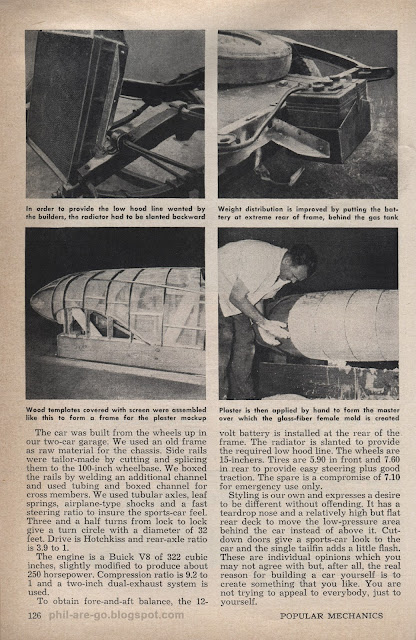
Home Made Sports Car - Garage find, after 18 months.

To commemorate the somethingth annual Chicago Auto Show and Concept Car Disappointment Parade, we're doing a week of car features. So far, so good. Today we bring you a 1956 article from Popular Mechanics about a father and son who built a sports car in their garage. You're probably thinking that a project like that is a huge amount of work, but actually it's a huge amount of work. We present for you all three pages of this interesting article describing how they did it. Please find it interesting.

"I though you were gonna do the styling." "No, I thought YOU were!"
Well, somebody must have done it."
It's a rare thing to find someone who's a brilliant engineer AND a brilliant artist. I'm way more artist than engineer. I've built a few pieces of furniture to fill a need, but they usually turn out to have one or two obvious flaws that tell you it was designed and built by an artist, not a proper carpenter, such as being partially on fire, or being 31% useful for it's intended purpose.

This sports car has a curb weight of 2500 pounds with a 250 horsepower V8, and a perfect 50/50 weight distribution. Impressive, especially for '56. It also has the look of a balloon with a zip tie around it. You can't have everything.

This does not diminish the achievement of building your own car from scratch. I sure as hell couldn't do it, even if I could design one that looked better. My design would live forever as a drawing on paper. You can't drive a drawing... until the next iPad changes that or something. And, as the article says, "These are individual opinions which you may not agree with but, after all, the real reason for building a car yourself is to create something that you like. You are not trying to appeal to everybody, just to yourself." Absolutely. Just getting any shape at all to come intact from your wood frame / plaster / fiberglass layup process is an a victory. Who cares what some jerk fifty years in the future thinks. "Eff you futurejerk!" Hey, that's me!

I'd have to say that the relative positions of the battery and gas tank spells
trouble in the case of a rear-end collision. Pinto, anyone?

This concept car will arrive in the marketplace in the shape of a perfect cube after design changes driven by committee review, accounting adjustments and market testing. It will have a one-cylinder engine, nine-seats, forty cup holders, rear seat diaper changing station, and convenient vomit troughs throughout.


2/11/13

1936 Lincoln Le Baron - This isn't your father's Oldsmobuick, unless it is.

The Chicago Auto Show / Chicago Disappointment Parade has concluded it's first weekend. The masses came shuffling in, goggled in wonderment at the concept cars that demonstrate what the manufacturers are capable of when not enslaved by focus groups and budgetary constraints. Then, after asking when they can buy one, they were directed to a "new" production model that looks exactly like the car they drove to the show.

An alternate title for this post was "This isn't your father's Flintstonemobile", but after a slightly furious round of debate around the office, we went with the Oldsmobuick one. The term "Oldsmobuick" came from the Fletch books. he described his divorce lawyer's car that way. It also applies because the car in this ad is so old, I can't guess by looking at it what make it is, or even what country it came from.

Dad used to complain that all cars look alike nowadays. I was incapable of making understand that it's relative. By contrast, I would patiently explain, that any car minted before 1950-something looks generic to me. Humps and tubes, man. They all look like a carton of eggs. I have no idea what I'm looking at. Dad proved my point while thinking he was proving his, by insisting that he could tell a Buick from a Ford from a Chevy, so long that they were old enough to be fossilized.

This ad kind of backs me up (but not really) by being a Le Baron, which is a model name that I have always known as a Chrysler. Then there's the nutty kitty cat hood ornament. Doesn't England get mad when you put a Jag hood ornament on a yankmobile?


Aaaaah, it's a doggie. It just happens to be in the exact same pose as the Jag ornament. If I were England, I'd still be mad. I'd then have my revenge by pointing out that almost any Jag could run rings around this Oldsmobuick.

This Lincoln Le Baron comes to us from the pages of Fortune magazine, the favored periodical of the horsey set. Here we find Thurston Rufftondale having a pic-a-nic with the St. John-Smythes at the club. Oh gawwwd!

Maybe the St. John-Smythes do have a special touch with the horses? They've trained their new colt for the season, "Aunt Fanny's Nanny" to carry his own lunch to school. Off he goes! Insert your own joke about equine education and "horse sense" here. I'm too clever to go for the low-hanging fruit.


Click for Big