Showing posts with label 1983. Show all posts
Showing posts with label 1983. Show all posts
2/3/20
12/3/19

8/26/19

7/20/18

11/15/16
Honor Brand Frozen Foods - An comic strip. Ha. Ha. Ha.
Hey, seasonal eaters! Are you looking for a great Thanksgiving comic strip for your Autumnal Localized Harvest Feast? Well, look no firther than this hi-larious ad from Honor brand Frozen Foods, and then look further than this ad from Honor Brand Frozen Foods!
 Ah-hahahahahahahaha! get it? The funny part is that the turkey doesn't want his slaughtered corpse to be placed next to an inferior brand of side dish.
This pretty morbid and weird, but we can do one better: The Star-Kist tuna campaign in which Charlie the Tuna yearns for acceptance from the Star-Kist tuna company.
It's an old cmapaign, and for decades, the humor in the ads stemmed from Charlie's misunderstanding that Star-Kist wanted tunas with good taste, as opposed to tunas that taste good. However, somewhere in The Eighties, Star-Kist abandoned this angle, and Charlie seemed to finally understand what the tuna giant was after. This changed his attitude not at all.
One thousand and six years ago, when I worked at a cartoon studio, one of our reliable clients was Star-Kist. We animated a number of those commercials, and at that time, Charlie definitely seemed to have a suicidal fascination with being killed, ground into a sort of paste, packed in a can, and eaten by humans. It was weird.
Sadly, the P.A.G. Research and Googling Squad can find none of our commercials on FaceTube, but this one from 1983 (not animated by us) is a decent example of Charlie's weird obsession.
This commercial doesn't have the long-time tag line "Sorry, Charlie. Star-Kist doesn't want tunas with good taste. Star-Kist wants tunas that taste good." By 1983, someone seems to have straightened Charlie out... not that he seems to care.
Ick. Frikkin' bizarre.
Aaaaanyway, it's not every day you find a thanksgiving Graphic Gift, so we'll take them where we find them. Here's the super funny cartoon from this 1950 ad, minus the caption, in original papery form and a cleaned-up line art versions. Maybe you can use it to make your Thanksgiving invitations moreadorable disturbing? You may stand a better chance of having lots of leftovers all to yourself. Diabolically clever, I must say.
You're welcome!


This pretty morbid and weird, but we can do one better: The Star-Kist tuna campaign in which Charlie the Tuna yearns for acceptance from the Star-Kist tuna company.
It's an old cmapaign, and for decades, the humor in the ads stemmed from Charlie's misunderstanding that Star-Kist wanted tunas with good taste, as opposed to tunas that taste good. However, somewhere in The Eighties, Star-Kist abandoned this angle, and Charlie seemed to finally understand what the tuna giant was after. This changed his attitude not at all.
One thousand and six years ago, when I worked at a cartoon studio, one of our reliable clients was Star-Kist. We animated a number of those commercials, and at that time, Charlie definitely seemed to have a suicidal fascination with being killed, ground into a sort of paste, packed in a can, and eaten by humans. It was weird.
Sadly, the P.A.G. Research and Googling Squad can find none of our commercials on FaceTube, but this one from 1983 (not animated by us) is a decent example of Charlie's weird obsession.
This commercial doesn't have the long-time tag line "Sorry, Charlie. Star-Kist doesn't want tunas with good taste. Star-Kist wants tunas that taste good." By 1983, someone seems to have straightened Charlie out... not that he seems to care.
Ick. Frikkin' bizarre.
Aaaaanyway, it's not every day you find a thanksgiving Graphic Gift, so we'll take them where we find them. Here's the super funny cartoon from this 1950 ad, minus the caption, in original papery form and a cleaned-up line art versions. Maybe you can use it to make your Thanksgiving invitations more
You're welcome!


1/25/12
Video Pro Glove - It must be gone for!
Video Games magazine, 1983. Gamers receive a glimmer of hope for their sore, blistered palms: the Video Pro Glove.
 Designed by mother and video game outsider Carmel Delaney, it was meant to protect the tender palms of 1983's game addicts. Clearly, the obvious need for such a product is demonstrated by the widespread use of gaming gloves we can observe here in The Future. Wait a second. I've just been informed that nobody wears gloves to play video games. Oh well. People aren't always ready for The Next Great Idea.
This is not to say that people have stopped trying to sell us video gaming gloves. Far from it. However, Delaney was so far ahead of her time that those whose time she was also ahead of are still ahead of their time. That's a lot of time-aheadness. She was a visionary.
A year after the Video Pro Glove was released to a baffled public, the gloves found a home on the hands of Johnny Lawrence, noted Prell user and super-mean leader of the Cobra Kai gang. Their motto was "No mercy... except perhaps for your blistered hands! But definitely no mercy for split ends!"
After losing to Daniel Laruso in the All Valley Karate Tournament, Johnny became Greg Tolan and took up competitive food spilling (ESPN 3, most Wednesdays at 2:30 am.), eventually locking horns with Rick Morehouse in the cafeteria. Again, he looked to the Video Pro Glove for protection during Critical Bullying and Narrative Exposition Events (CBNEEs).
So really, just like the iPhone, duct tape, and electric scalp massagers, the Video Pro found a role in society beyond the original intended purpose. This is the sign of true genius. Carmel Delaney is one such genius. Maybe there's a little Carmel Delaney in all of us? Don't you think? No. Definitely not. ...Or is there?... No.

This is not to say that people have stopped trying to sell us video gaming gloves. Far from it. However, Delaney was so far ahead of her time that those whose time she was also ahead of are still ahead of their time. That's a lot of time-aheadness. She was a visionary.
 |
| Video Pro's primary off-label application: beating up Daniel-San. |
 |
| The metal edges underneath a standard banquet table are rarely de-burred. |
After losing to Daniel Laruso in the All Valley Karate Tournament, Johnny became Greg Tolan and took up competitive food spilling (ESPN 3, most Wednesdays at 2:30 am.), eventually locking horns with Rick Morehouse in the cafeteria. Again, he looked to the Video Pro Glove for protection during Critical Bullying and Narrative Exposition Events (CBNEEs).
So really, just like the iPhone, duct tape, and electric scalp massagers, the Video Pro found a role in society beyond the original intended purpose. This is the sign of true genius. Carmel Delaney is one such genius. Maybe there's a little Carmel Delaney in all of us? Don't you think? No. Definitely not. ...Or is there?... No.
11/23/10
Synapse C64 Games - The beginning of greatness.
My gaming life began on those horrible Pong systems. You bought a console with a pair of paddle controllers, hooked it to your TV, and you could play Pong or one of it's variants, like "vertical pong" or "small paddles pong". This was still heart-stoppingly exciting, but now it's embarrassing to admit. Somehow a rectangle was more interesting than Johnny Carson if you could make it move.
The jump from "symbols" to - I'm going to drop a line of demarcation here - "actual graphics" was brain-explodingly amazing. After seeing little people on your friend's TV screen instead of squares made it hard to ever go back to your suddenly lame Atari 2600 version of Combat at your own house and pretend to be satisfied. This ad for Synapse games shows what I mean.

Yes, by the time the C64 appeared, the Atari 2600 was running much better software, thanks to Activision. But once one saw what the Commodore could do, you began to wish your dad was a stock broker douchebag so you could get one. Nothing else was close.
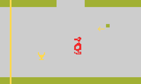
 Pharaoh's Curse looks like a pretty standard platform game, but when you consider that this was 1983, the idea of a large scrolling environment to explore was pretty exciting. Pitfall II was a similar title available on the Atari, and I found the game so compelling, I drew a map of the entire game on graph paper and plotted out my path. The map was about three by four feet, with every enemy and pickup drawn in ridiculous detail. I felt like Columbus, charting a new world. The fact that it is immediately recognizable as a game whose basic functionality is still repeated more than twenty years later is pretty high praise.
Fort Apocalypse looks pretty damn good too, for 1983. It looks similar to Choplifter, which featured a lovingly animated helicopter that tilted perfectly as you swooped around rescuing little soldiers. This was a far cry from what had gone before, which was a square or worse yet, a flickery jumble of squares that game designers sheepishly hoped you would accept as a helicopter.
Protector II looks to be a pretty shameless copy of Defender, right down to the name. Plagiarism was rampant among PC game companies back then. I don't think copyright laws had caught up with the gaming industry just yet.
This generation of games reflects a certain point of maturity in the games industry. Games now needed to be produced by, at minimum, a two-person team, instead of just one programmer with no real art skills. A programmer needed to either be a part time artist or have an artist buddy help him out with his game. This looks like the beginning of specialization in gaming that still continues to this day. If you want a job at a game company now, "game artist" is a title that hardly exists. You are a concept artist, 2D animator, motion graphics artist, interface designer, 3D modeler, rigger, texture artist, or environment designer, etc. Often, companies will interview artists for a very specific role, not just "artist" I think the generation of games shown in this ad captures the point at which game companies had just begun to hire artists.
 By contrast, look at Adventure, an Atari game from 1979. It was a groundbreaking game and featured many "firsts". First adventure game on a home console. First game to allow a player to manage an item inventory. First multi-screen adventure game. First hidden message or "easter egg" in a game. The easter egg was this: "created by Warren Robinette". He was a programmer that made the game singlehandedly, though he wasn't an artist. The genius of the gameplay is famous, but the art is still pretty funny. At the time, it was fine, because as an early Atari game, the console didn't have the horsepower to display any real art. By the time the C64 came to be, the computers were ready for artists.

The jump from "symbols" to - I'm going to drop a line of demarcation here - "actual graphics" was brain-explodingly amazing. After seeing little people on your friend's TV screen instead of squares made it hard to ever go back to your suddenly lame Atari 2600 version of Combat at your own house and pretend to be satisfied. This ad for Synapse games shows what I mean.

Yes, by the time the C64 appeared, the Atari 2600 was running much better software, thanks to Activision. But once one saw what the Commodore could do, you began to wish your dad was a stock broker douchebag so you could get one. Nothing else was close.
 Pharaoh's Curse looks like a pretty standard platform game, but when you consider that this was 1983, the idea of a large scrolling environment to explore was pretty exciting. Pitfall II was a similar title available on the Atari, and I found the game so compelling, I drew a map of the entire game on graph paper and plotted out my path. The map was about three by four feet, with every enemy and pickup drawn in ridiculous detail. I felt like Columbus, charting a new world. The fact that it is immediately recognizable as a game whose basic functionality is still repeated more than twenty years later is pretty high praise.
Fort Apocalypse looks pretty damn good too, for 1983. It looks similar to Choplifter, which featured a lovingly animated helicopter that tilted perfectly as you swooped around rescuing little soldiers. This was a far cry from what had gone before, which was a square or worse yet, a flickery jumble of squares that game designers sheepishly hoped you would accept as a helicopter.
Protector II looks to be a pretty shameless copy of Defender, right down to the name. Plagiarism was rampant among PC game companies back then. I don't think copyright laws had caught up with the gaming industry just yet.
This generation of games reflects a certain point of maturity in the games industry. Games now needed to be produced by, at minimum, a two-person team, instead of just one programmer with no real art skills. A programmer needed to either be a part time artist or have an artist buddy help him out with his game. This looks like the beginning of specialization in gaming that still continues to this day. If you want a job at a game company now, "game artist" is a title that hardly exists. You are a concept artist, 2D animator, motion graphics artist, interface designer, 3D modeler, rigger, texture artist, or environment designer, etc. Often, companies will interview artists for a very specific role, not just "artist" I think the generation of games shown in this ad captures the point at which game companies had just begun to hire artists.
 By contrast, look at Adventure, an Atari game from 1979. It was a groundbreaking game and featured many "firsts". First adventure game on a home console. First game to allow a player to manage an item inventory. First multi-screen adventure game. First hidden message or "easter egg" in a game. The easter egg was this: "created by Warren Robinette". He was a programmer that made the game singlehandedly, though he wasn't an artist. The genius of the gameplay is famous, but the art is still pretty funny. At the time, it was fine, because as an early Atari game, the console didn't have the horsepower to display any real art. By the time the C64 came to be, the computers were ready for artists.
11/1/10
Vic-20 - Believe your eyes.
Poor, poor computers. Due to the basic reality of Moore's law, the laughability of old computers progresses in direct proportion to the power of new ones. As much of a superstar the newest, powerfulest machine is right now, it'll be the butt of jokes in, say, twenty years or so, when someone comes across advertisements proclaiming it's power.
 Those CAN'T be actual Vic-20 screens, you lying bastard! The graphics are hyper-real! Actually, they're not too bad for 1983, considering that your TV's remote probably has more computing power than a Vic-20.
Click the image to enlarge, and anyone over the age of twenty should be able to name the games being ripped off here. From left to right, they look like Galaga, Defender, Something with squares in it, and Donkey Kong Junior.
The airbrushed eyeballs at the top are pretty terrible. Remember how everyone in the eighties was convinced that airbrush was the ultimate medium? Here's an example of a bright-eyed young artist trying his hand at sprayed art. Ug. Shading human skin requires a lot of different colors delicately balanced. Lots of finesse. This guy painted some salmon orange color and shaded with brown. See the highlight on the right side of the nose there? Never spray white directly onto your base tone. You need to go through a yellowish color before you get to white or the white will look chalky and blue. Ah well, video games were a small industry back then, and Sierra probably didn't pay much.
Sierra On-Line is remembered with a moist eye by many computer game old-timers. They were a husband and wife team who made some of the greatest graphical adventure games like King's Quest. They took the classic text-based adventure game format (like Zork) and added graphics. Since text-based games made your imagination work to create the pictures, adding graphics to stories of similar quality was a big leap in immersion. Compared to pure text, graphics of any kind were mind-blowing. Sierra never leaned too heavily on graphics. They (almost) always emphasized compelling story telling.
So what's with these arcade game knock-offs? I think the popularity of games like Donkey Kong and Defender - and the sweet sweet cash they earned - were too tempting to ignore.

Subscribe to:
Posts (Atom)